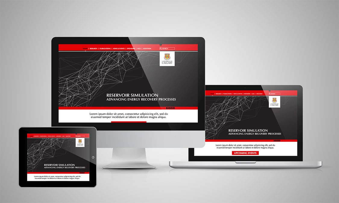
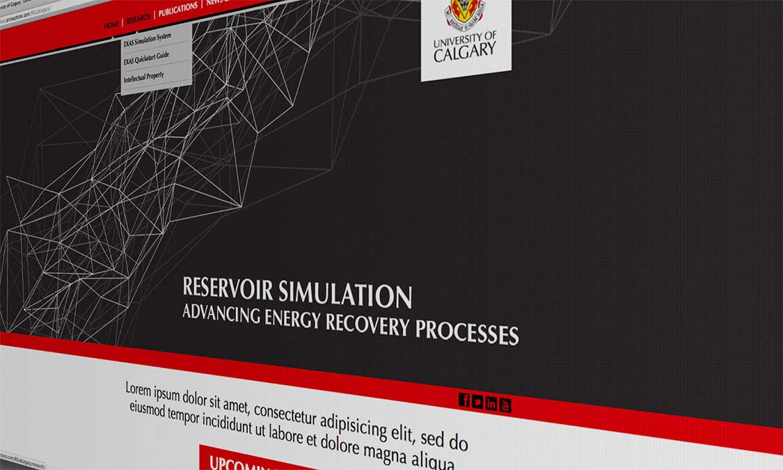
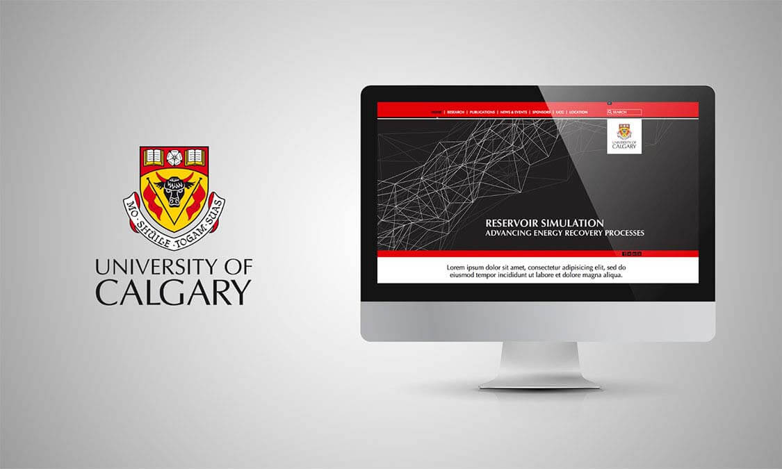
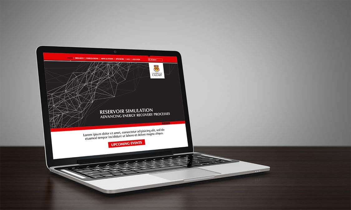
Being involved with the University of Calgary’s redesign of their website was a very exciting project to be a part of. When the UofC came to us they had a fantastic website which was full of excellent information, but it was presented in a way that was visually unexciting and did not attract the attention the content deserved. It looked unreadable and was not inviting a user to become engaged with the message that UofC had to impart. In simple marketing terms, the site was not attractive.
Working with those who had collected the information, we began to understand what they wanted to say and who they wanted to reach. We quickly defined their chosen demographic and carefully crafted a framework that would make the information appeal to a broad spectrum of audience. We could not afford to make a site that would only appeal to University of Calgary alumni, or to Calgary marketing agencies, we needed to appeal to those who would gain from the information. This made the project a delicious challenge as there is no ‘one size fits all’ at Arc Reactions. We stake our reputation on providing marketing that works, and this was a task that would be an adventure. We had a strict rubric and well-defined goals. That’s when we are at our most creative.
The first and most imperative objective was to make the web pages automatically multi-size. Each device uses a different parameter for screen size and resolution, and we knew that the information on the site would be accessed all over the world on every type of device from handheld to jumbotron, and it needed to look good wherever it was displayed. Any website is a window into your world, and we wanted that window to be perfect.
The colours of the site were simplified to reflect a classic, chic and resourceful palette of black, red and white, which was relatable to any demographic and exuded an air of confidence and academic gravitas. The choice of font and word placement was again uncomplicated and clean allowing the user to interpret as necessary, but always leading them to where they needed to be.
The classic, contemporary look allowed a timeless look that would not be subject to the follies of fashion but also allowed the University of Calgary to easily add pages as necessary and continue to build a living website that reacted to the current needs of their chosen demographic. The UofC was delighted with the outcome of the project and we are proud to continue to collaborate on other projects that achieve their goal of making academic information accessible for all.


