Conception
To create the marketing project for our concept company, Paradigm, we were allowed carte blanche on all concepts of the portfolio. The idea was that the invented client had no precognitive ideas about how, why or where the media should go and was happy to let
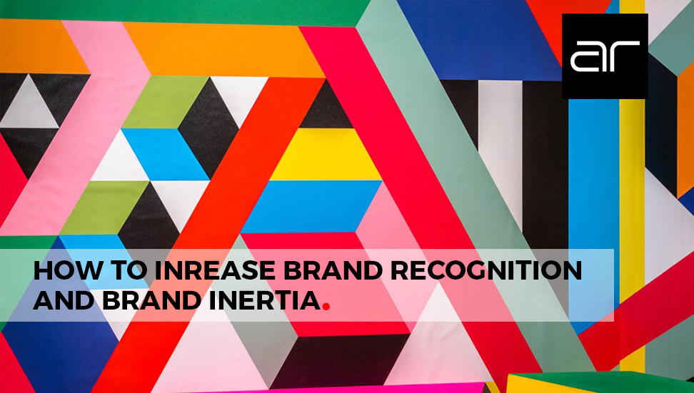
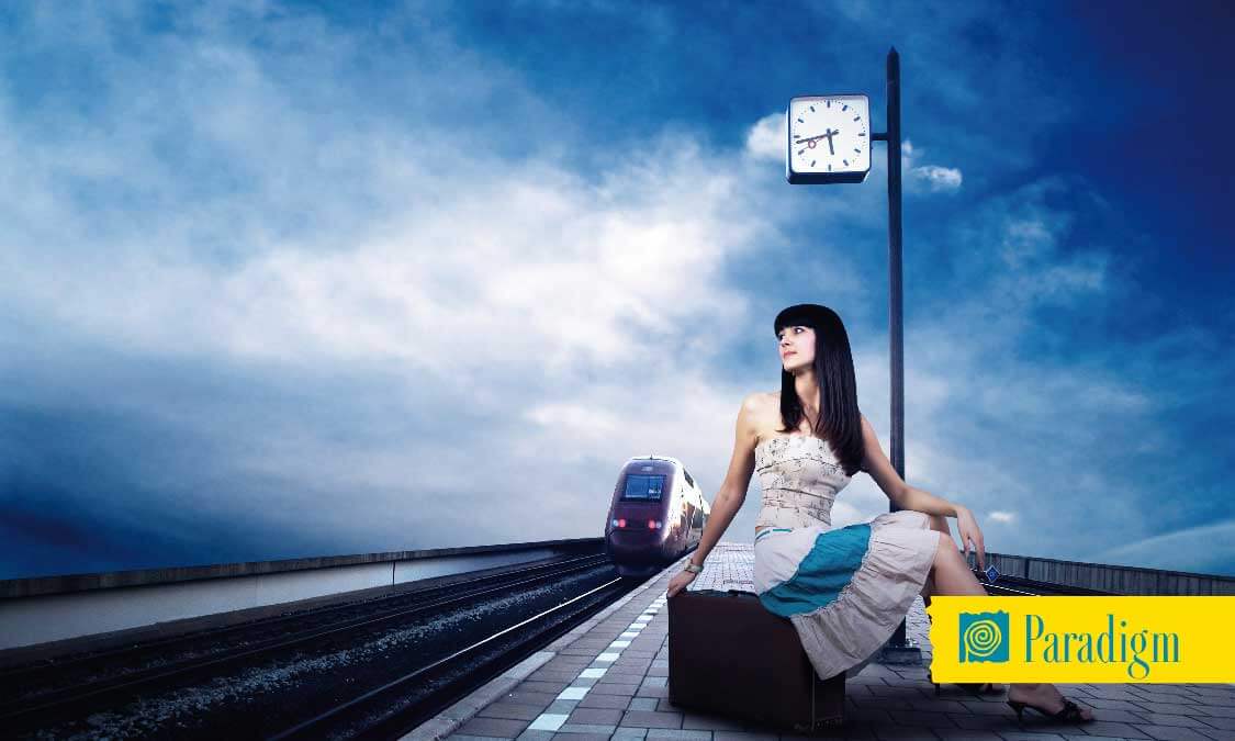
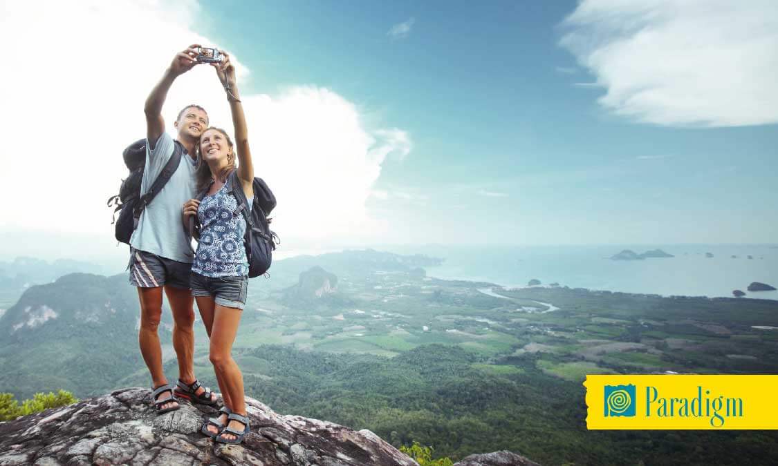
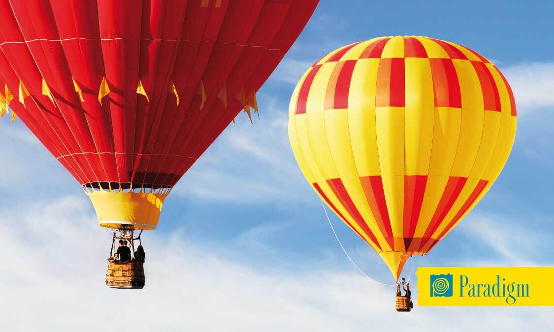
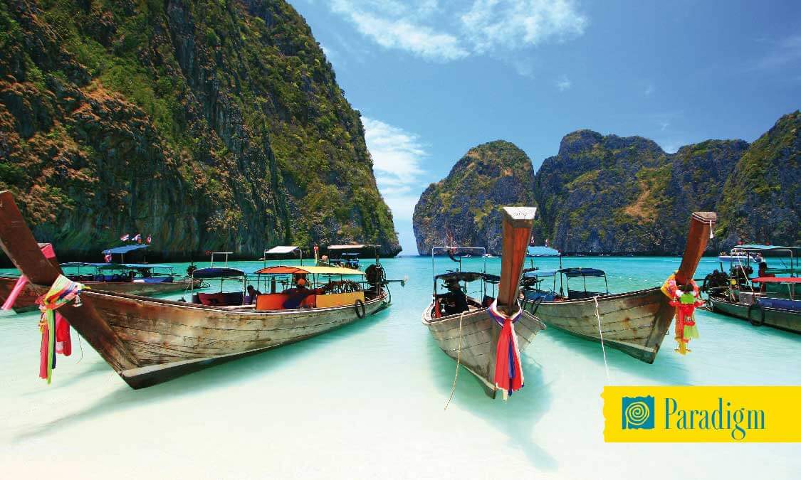
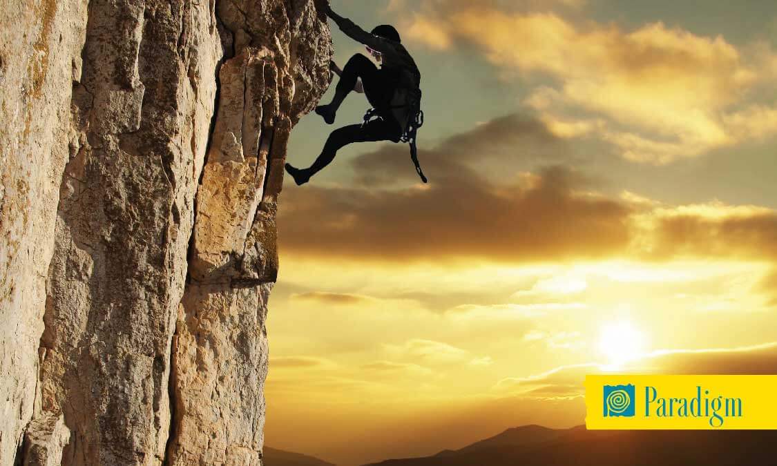
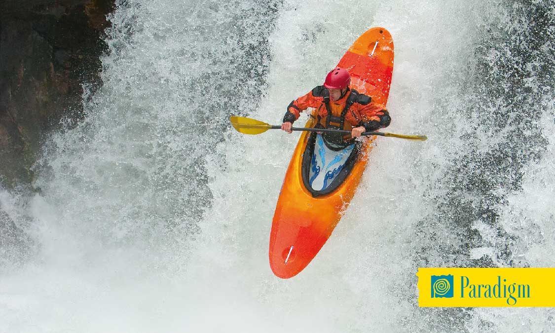
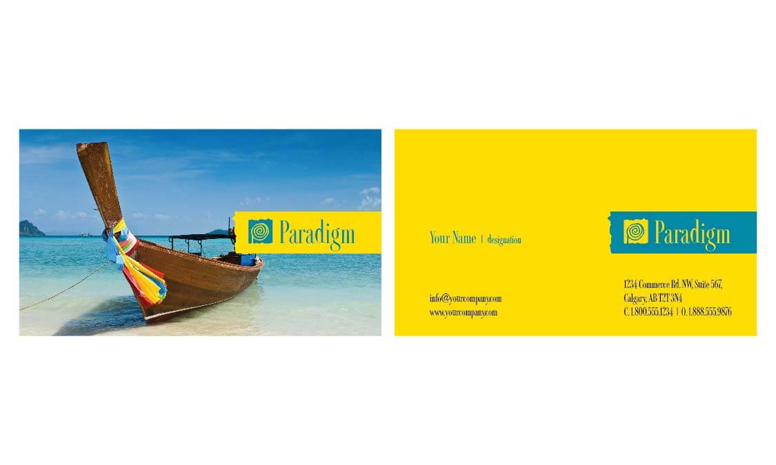
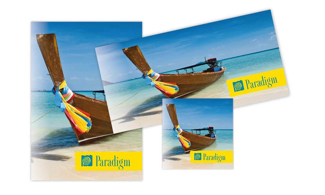
us conceive, create and communicate the marketing message. The word ‘paradigm’ means in essence, ‘Your view of reality’. This idea that you created your own reality was very exciting and quickly became the firm foundation we knew we could weave into a credible, artistic and spectacular campaign. The driving concept was that we used unfamiliar and exotic images, infused with rich and opulent colour that had a familiar atmosphere so the viewer could imagine themselves in that place or in that setting.
Creation
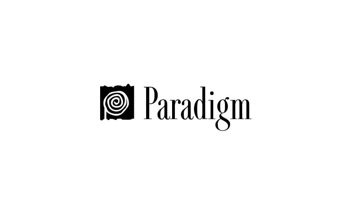
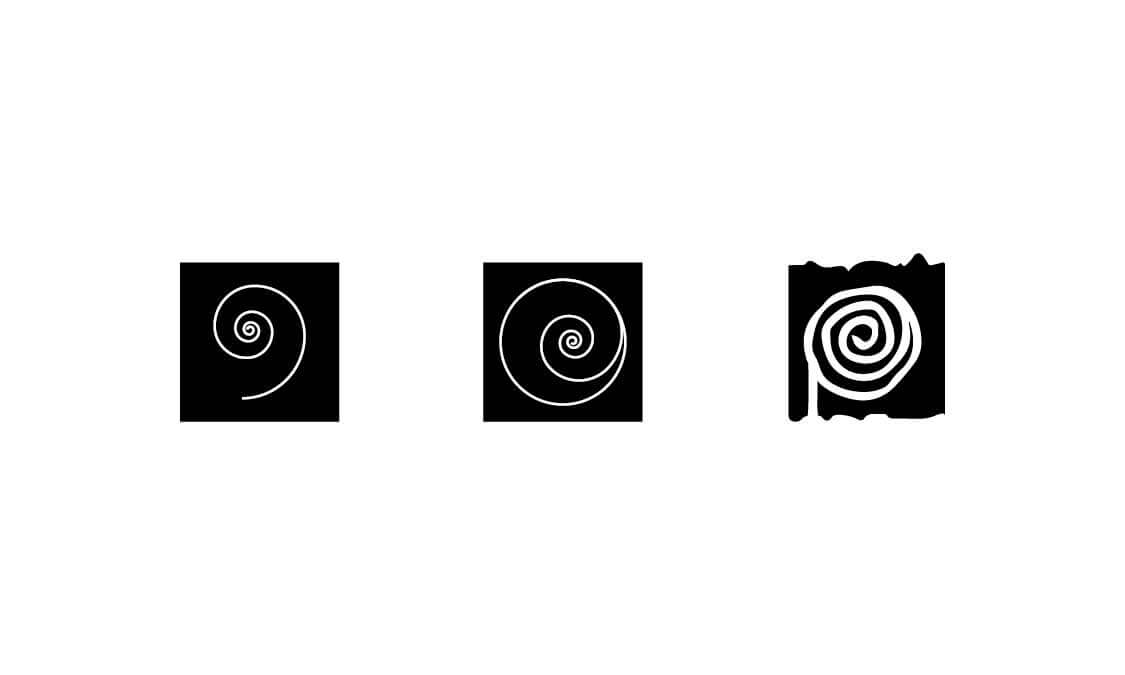
As with all successful media campaigns, there needed to be an anchor running through all the images to link the company to a brand. We decided to use a striking, easily interpreted letter based anchor created in strong, contrasting colours that would not be lost amongst the images, but would complement them and add a strong facet of cohesion. Yellow is a colour traditionally associated with effervescence so we chose a vibrant yellow in tone and hue. The complimentary colour of yellow is blue, but we needed to be careful to select exactly the right shade so that the word art ‘popped’ off the page. The brand logo needed to be able to stand out from the exotic and intoxicating photo. A simple spiral was digitally drawn to symbolize fashioning your own path, and to follow the ‘creating of your own view of reality’ we freestyled the spiral giving it a bohemian appeal.
Communication
The branding had purposeful placement so that the continuity of concept flowed through the whole portfolio. Choosing the images for the campaign became easy as we fused the colours of blue and yellow through the graphics, or highlighted splashes of the colours naturally within the image. By using digital manipulation we were able to match the colors of the brand that were found in the photos perfectly fusing the image and brand into one and solidifying the concepts behind the media. We were thrilled with the artistic, expressive and professional outcome of the project.
Are you ready to create something amazing? Have questions about design or promoting your business? We’re happy to help!
There are lots of ways to get in touch with us. You can find us on social media via the links below. Or, if you’re feeling formal, fill out the form to the left and we’ll get back to you shortly.