The Path
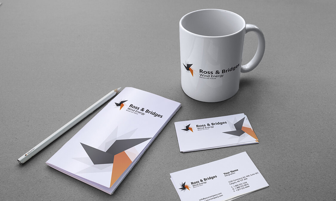
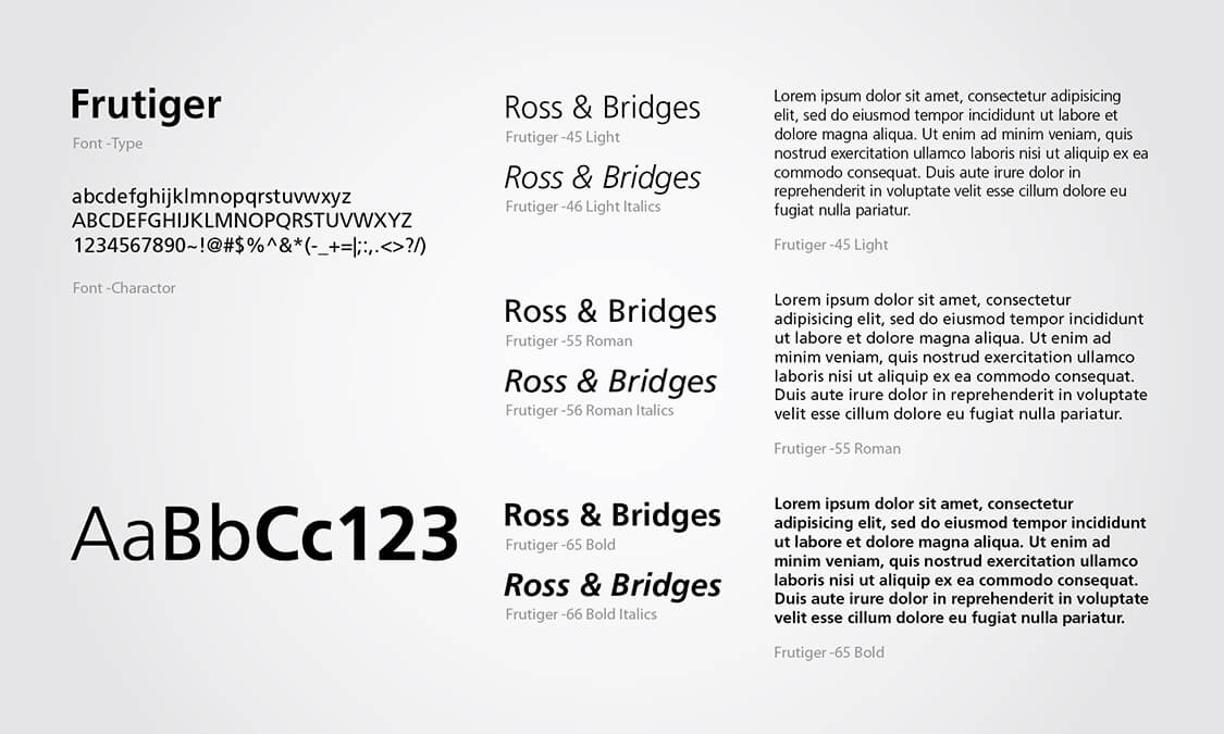
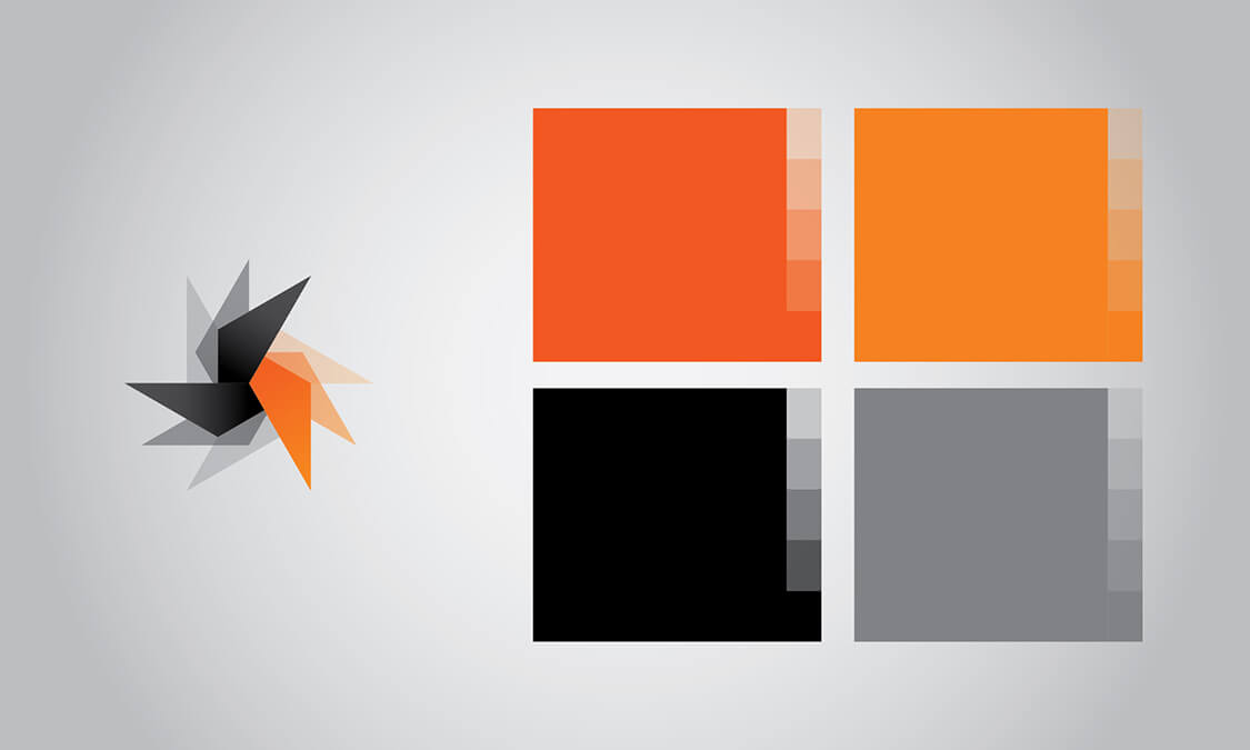
Ross and Bridges was our concept for a wind energy company, and an exciting project to be involved in. The idea was that we would be working with a forward-thinking, environmentally aware and adventurous company opened up many artistic avenues we could pursue. Capturing the essence of the company and linking it into a brand is always the goal of any good quality marketer, but Ross and Bridges gave us the opportunity to push the boundaries of creativity to create a stylish and sophisticated, expressive brand with a twist of the whimsical. The color palette of Ross and Bridges was predetermined by the existing company colors already in use. We decided that the color had to be the messenger and the images the message. From there we designed a campaign that accentuated the relationship between color and communication.
The Portal
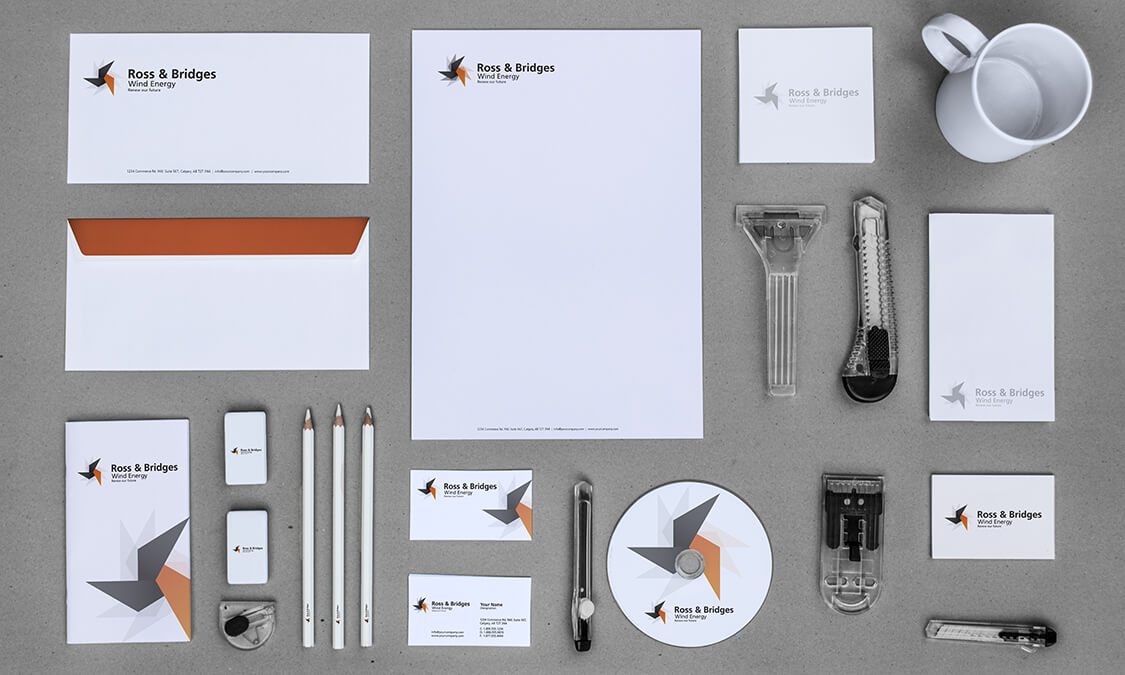
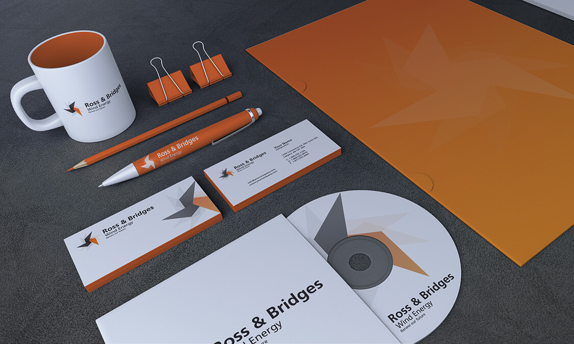
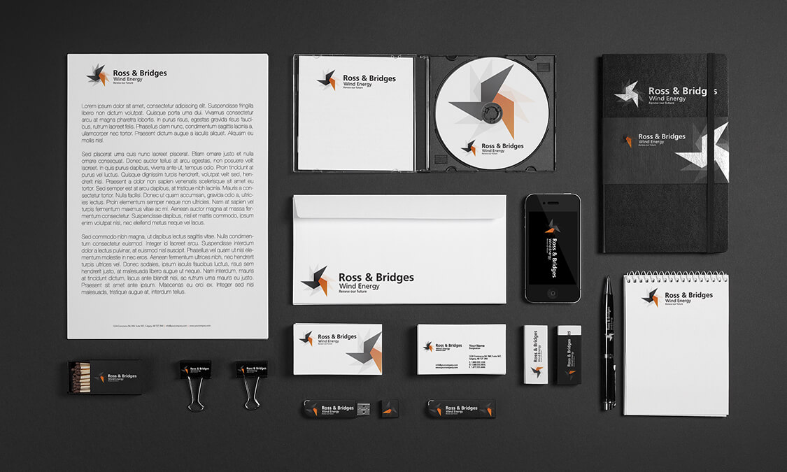
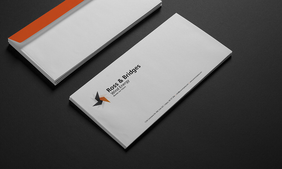
Orange and black are contrasting colors which suggest dynamic power and inexhaustible force. These were the perfect background for suggesting capability, capacity and competency without creating confusion. The color needed to be the strongest element of the design so that we could use familiar images that elicited feelings of trust in a brighter future, which was the brand of the company. Images were simplified and heavy elements of orange and black were used to guide the eye to important facets of the images. The color is the visual clue and the matter that binds the design together.
The Passageway
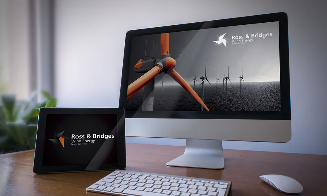
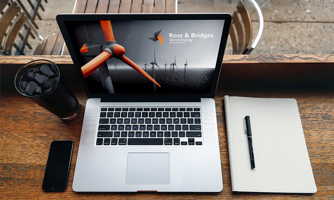
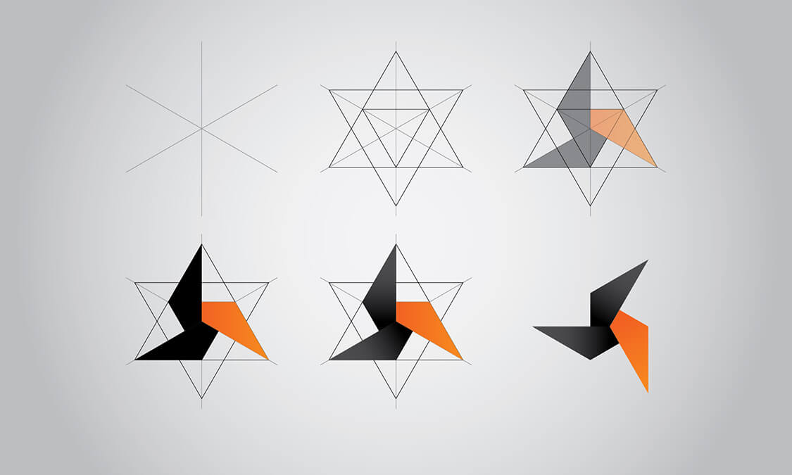
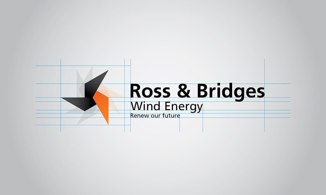
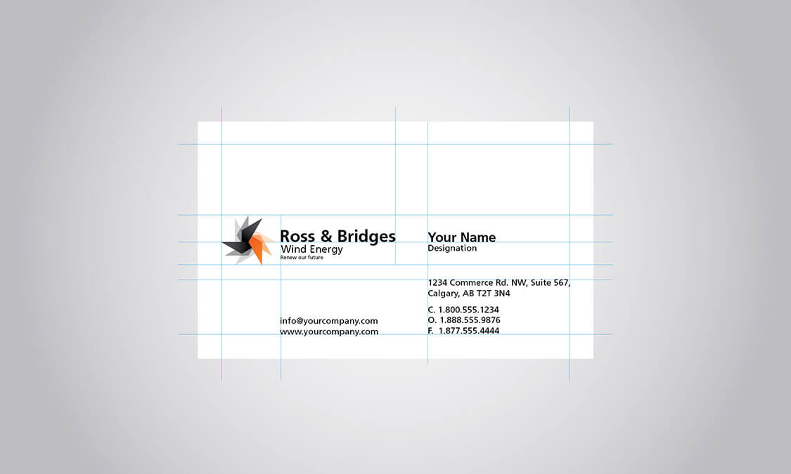
The first element we had to get perfect was the logo. The logo would become the identity of the brand, so we were anxious to reproduce the feel of power and movement that encapsulated Ross and Bridges. By using state of the art software we created and perfectly balanced simulation of a wind turbine in simple shape which created the feel of power by color, then superimposed the image in varying degrees of intensity to suggest movement. The effect was stunning and allowed us to use the brand on its own, or in various shades of black, white or orange and still convey the essence of Ross and Bridges. This brand could be used on any media bringing conformity and instant visibility. The color theme continued through the images which we reinforced by highlighting a turbine in color blocks. The overall impression was extremely effective and portrayed exactly what it needed to succinctly and with style.
Are you ready to create something amazing? Have questions about design or promoting your business? We’re happy to help!
There are lots of ways to get in touch with us. You can find us on social media via the links below. Or, if you’re feeling formal, fill out the form to the left and we’ll get back to you shortly.