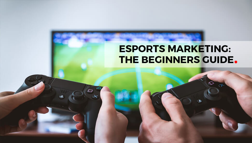

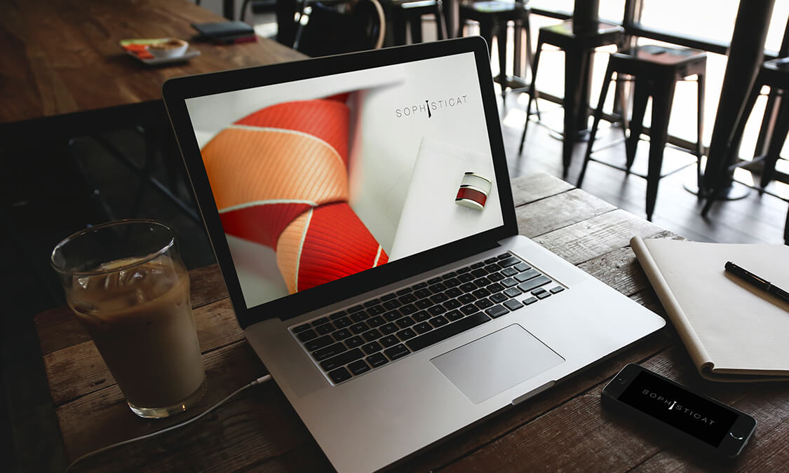
Cosmopolitan
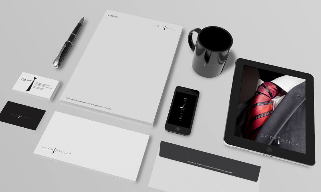
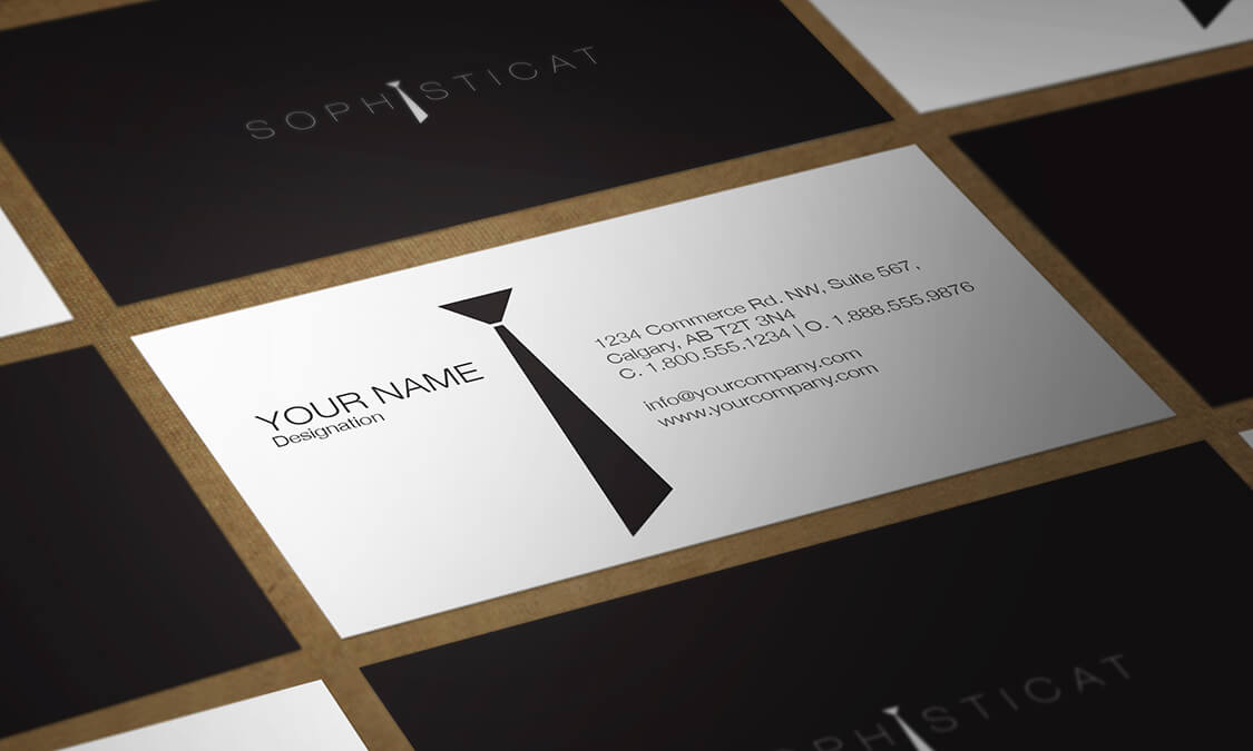
Sophisticat came to us as a concept which would allow us to discuss the possibility of creating a media campaign. It was a meeting of minds. The invented owners of Sophisticat knew what concept they were looking for but did know how to achieve it. What the client knew was that they wanted the idea behind the name to be the brand. We immediately turned to the meaning of the word ‘sophisticated’ and its associated themes. Inherently artistic concepts opened up such as chic, cultured, refined, cosmopolitan and desirable. The path was clear, but the journey was fraught with complications. With a clear theme, it is easy to go too far into one avenue of the concept and have it end up as parody. We needed to be sophisticated but keep it fresh, quirky and dignified.
Cultured
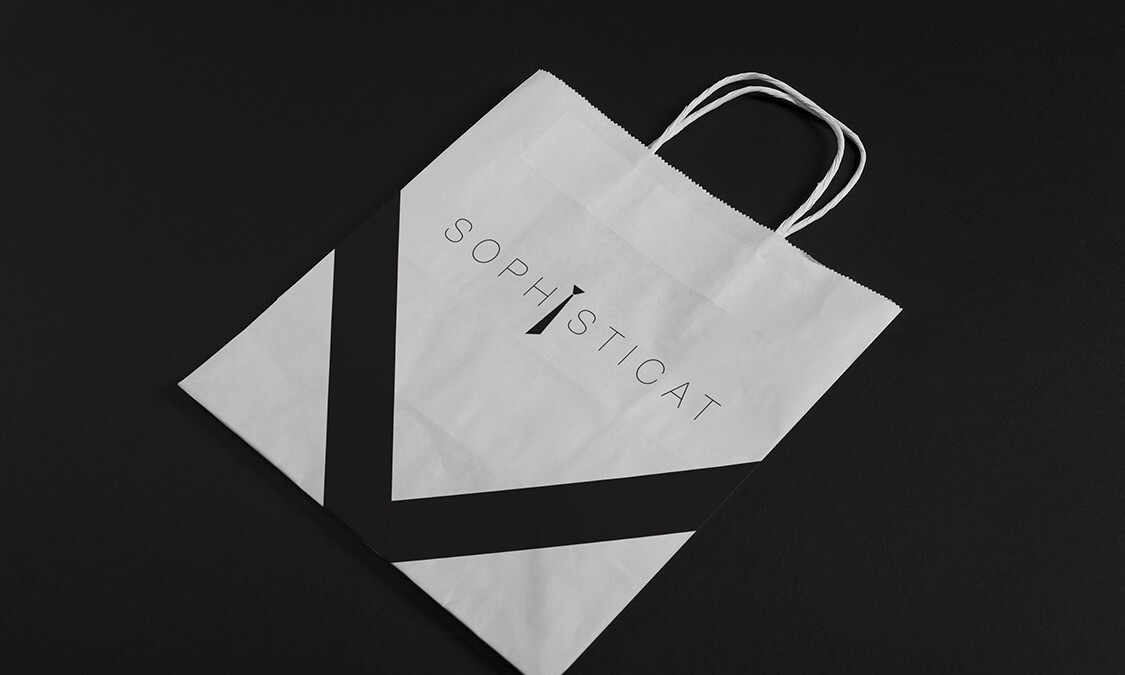
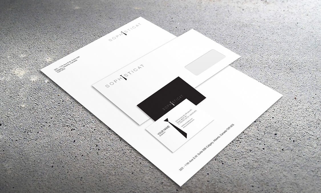
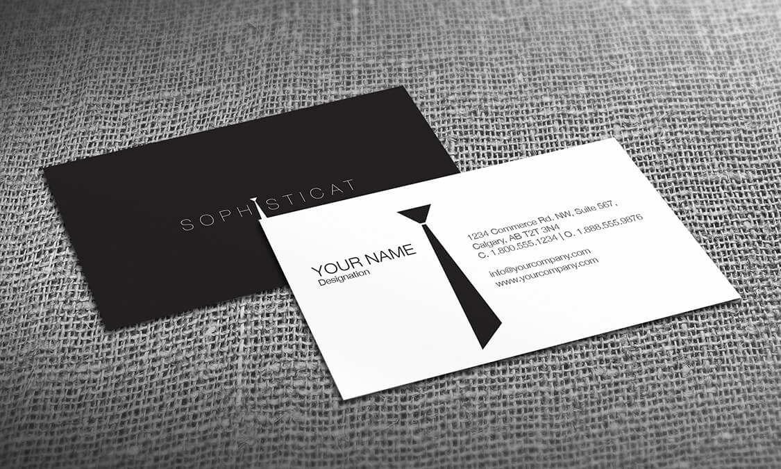
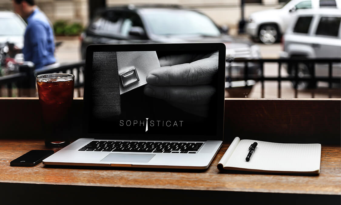
The product that defined Sophisticates’ line of business was high quality, classic men’s clothing. We were conscious we had to be very careful with which items we used to be the brand identity as with fashion most of all, times change. Picking something that was timeless was an important part of the strategy as it gave longevity to the project. Brand identity needs to be easily identifiable and constant, so we chose elements that would not age. Shiny dress shoes, crisp cuffs and cufflinks and a classic tie exuded the feel
of cool and cultured, without being stereotypical or predictable. These images all included an insignia of a rectangle to draw the images together. The cuff-links, the heels in reflection and the windows in the background of the photographs were bound together by theme and shape.
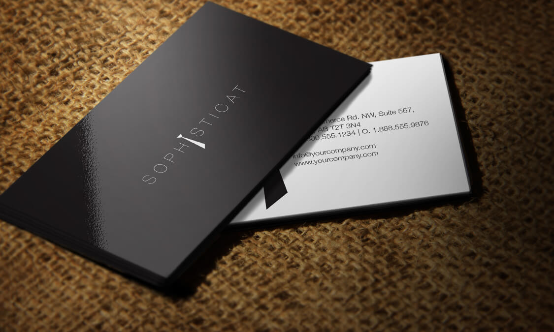
Cool
‘Black tie’ was the colour palette we chose to use. Nothing is more sophisticated than black and white, and nothing works so well in a classical setting. Using stark, striking colour is only one part of a complete artistic expression. The rectangle shape was chosen to reinforce the idea of a connection between the images and to ground the concept. It was clean, easy to identify and fitted seamlessly into the design. Space was used to focus attention on the products, and communicate stature. Very unusually the logo came towards the end of the project, having traversed many alleys to find the perfect brand identity and not stopping until it all meshed together and stood on its own merits.
Are you ready to create something amazing? Have questions about design or promoting your business? We’re happy to help!
There are lots of ways to get in touch with us. You can find us on social media via the links below. Or, if you’re feeling formal, fill out the form to the left and we’ll get back to you shortly.