Theme
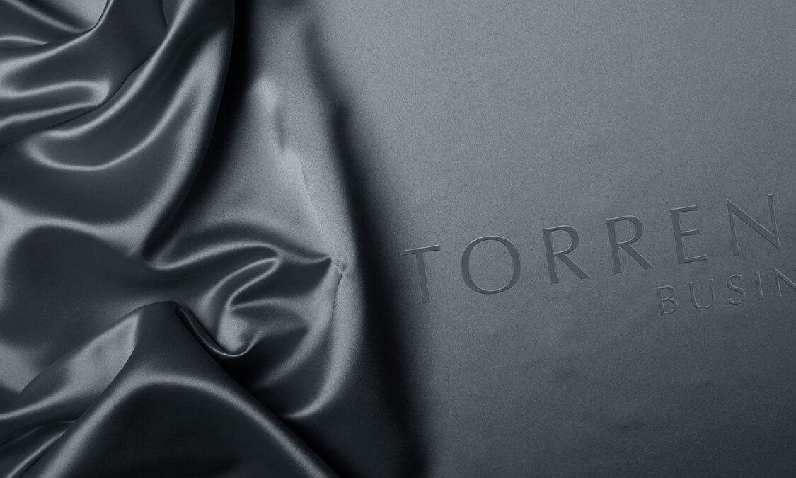
Torren and Smith is our concept for a well-established business law firm – solid, dependable and constant. With design art, you have to have a theme or concept in mind to direct the flow of the creativity. Selecting the right foundation to build the campaign on, is always critical to the final designs. Torren and Smith had a company image to uphold, and the graphical representation had to align itself with this branding. The premise that the whole project needed to be based on was ‘classical’. Solid, dependable and constant all
have an infinite appeal and excite feelings of trust, integrity and confidence. These are classic concepts and we wanted to play them to their full advantage.
Twist
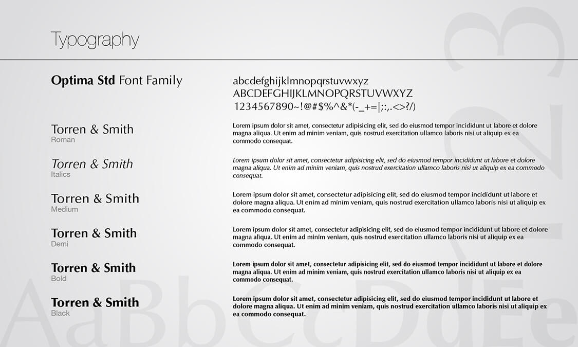
The classical element had many options, but we wanted to give it a twist that allowed Torren and Smith to own the design concept. After a quickfire concept session, we compiled a list of potential images that were unmistakeably classical, which we then detailed as to how we could produce them as an ‘alter ego’. Our aim was to take the two opposing themes and meld them into a new concept. In effect, make the classic – modern. Color is always a huge investment in the voice of any media. It is as important as the art itself. Again our course was directed by the resolute identity of the company image making sure that we carried on the theme of ‘classical’, solidifying the company brand.
Fusion
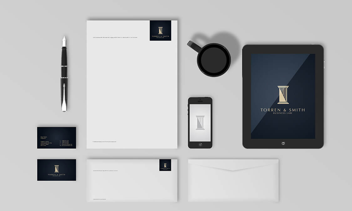
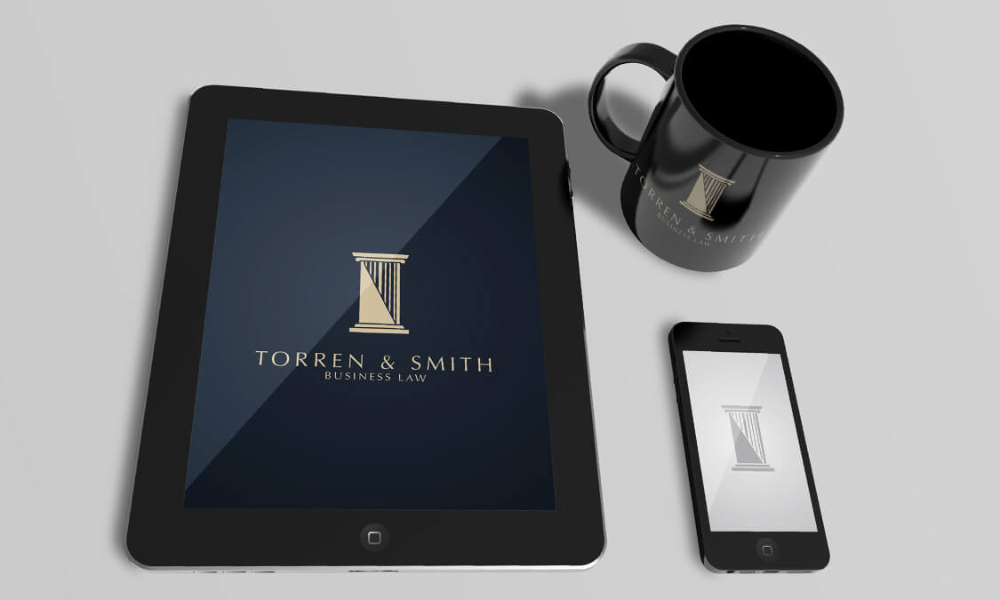
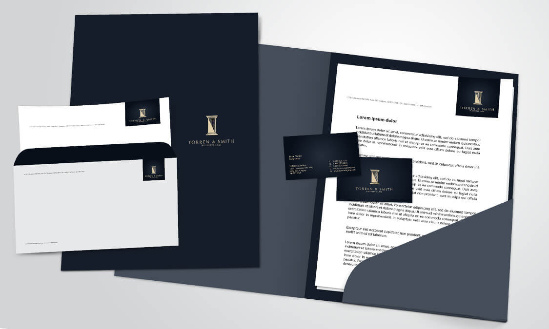
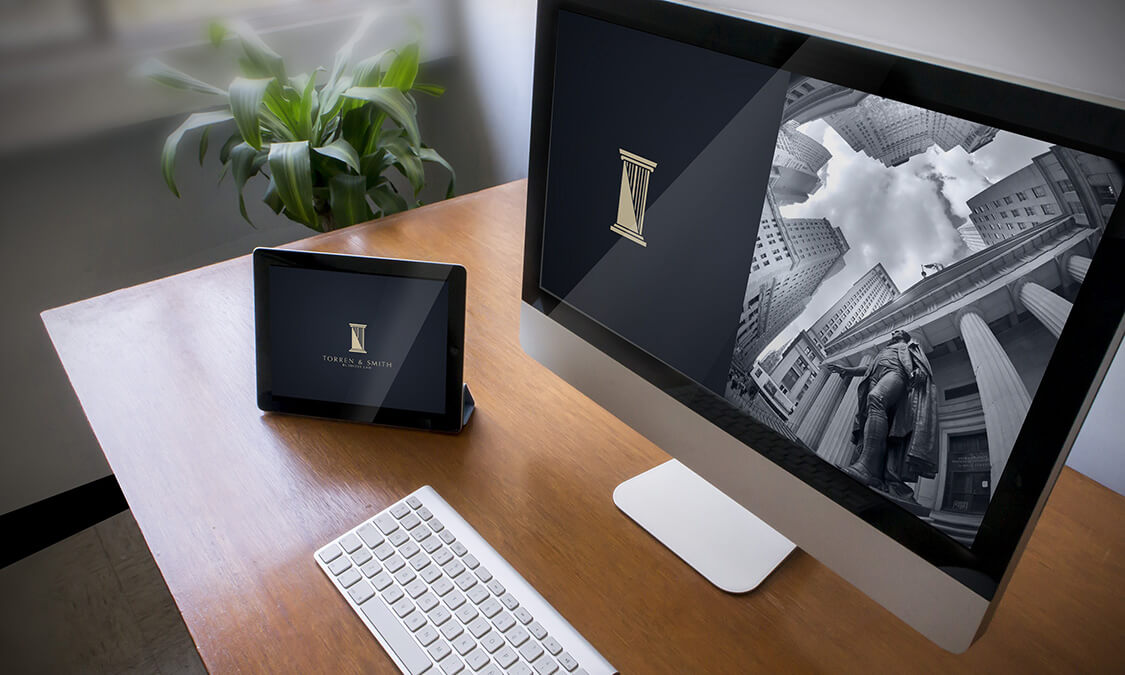
The searing of old and new was steered by the use of black and white photography and familiar objects that expressed business, justice and the unchangeable. The use of a well-recognized statue unmistakably suggested these three qualities, but to fuse it to the modern we had to take an unusual angle with an artistic lens to create an image that was intriguing and attractive without losing these essential qualities. A watch was used to infer a timeless aspect to justice, and a classical looking man in crisp attire for unchanging, and each was manipulated by intelligent use of photography to bring it around to a fresh appearance. The Logo was a clean line drawing of a column that also embodies the
brand, and all these carefully planned and crafted aspects came together to achieved an unspoken strength, interwoven with art, that does not come about without perseverance, intelligence and flair.


