Elegant
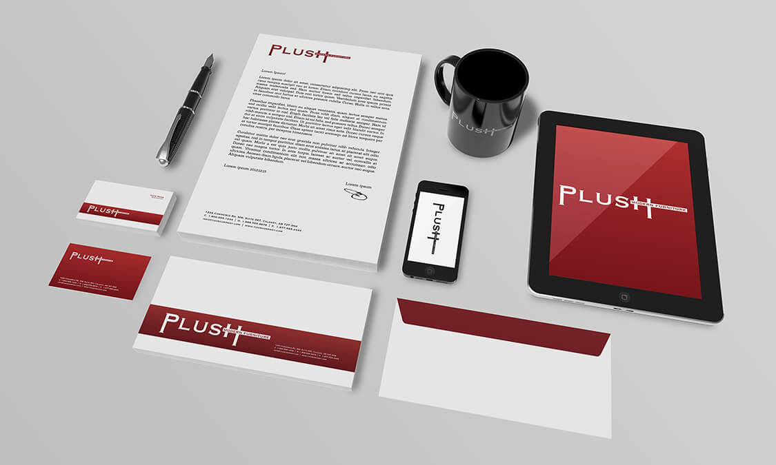
The Modernist movement in art was a period of time where lines were sleek and clean with a debridement of anything that could be construed as clutter. Plush Modern Furniture was a concept client that embodied the modernist movement and wanted the media campaign to reflect these core values. They wanted the whole effect to be simple, contemporary, visionary – almost radical – in feel, but still being appreciated by a larger demographic. This concept of clean, chic and uncluttered, we knew would be elegant in the images, but harder to portray in the printed media without looking barren. To fuse art and elegance we had to take the elements of the design we could use and extrapolate them, even extort them, to become the design.
Opulent
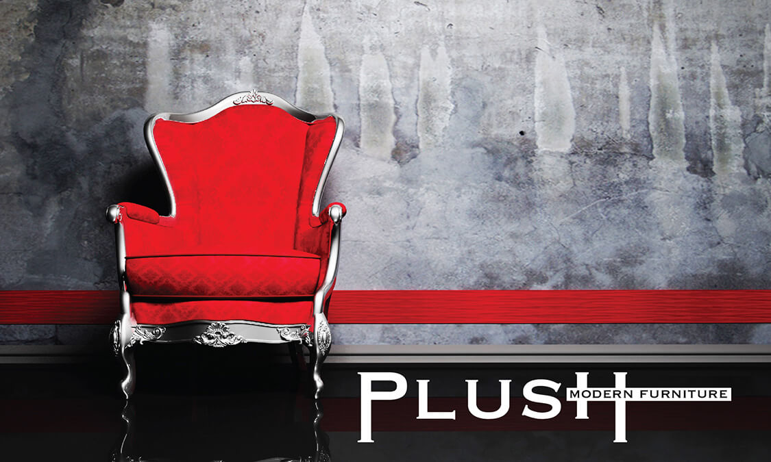
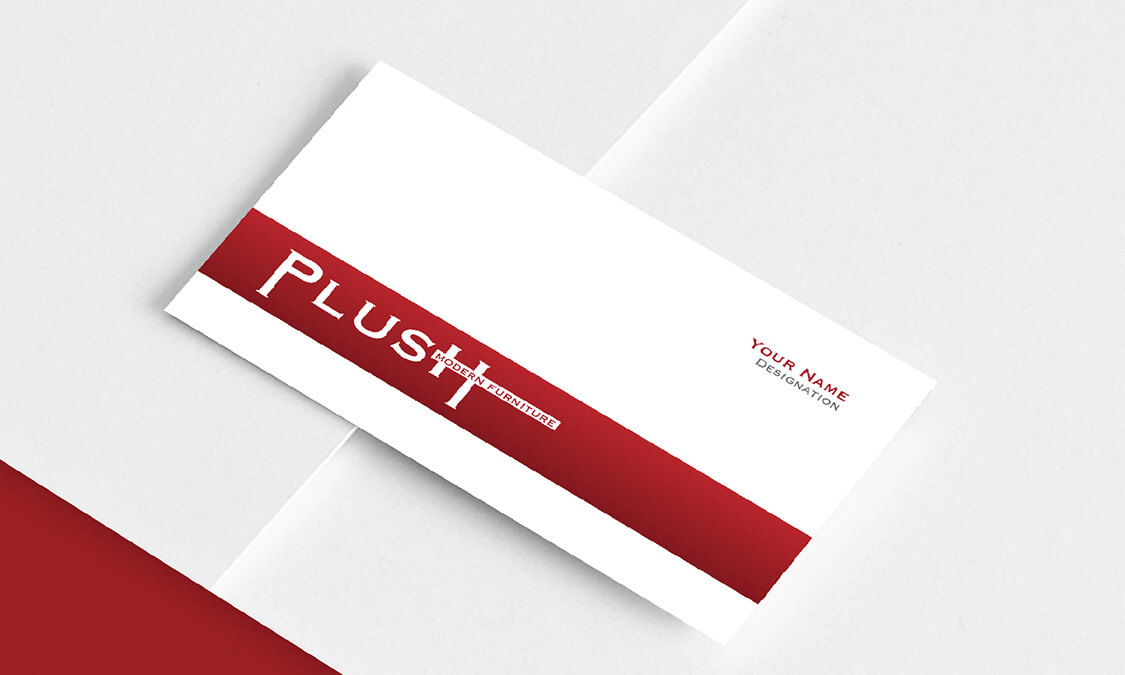
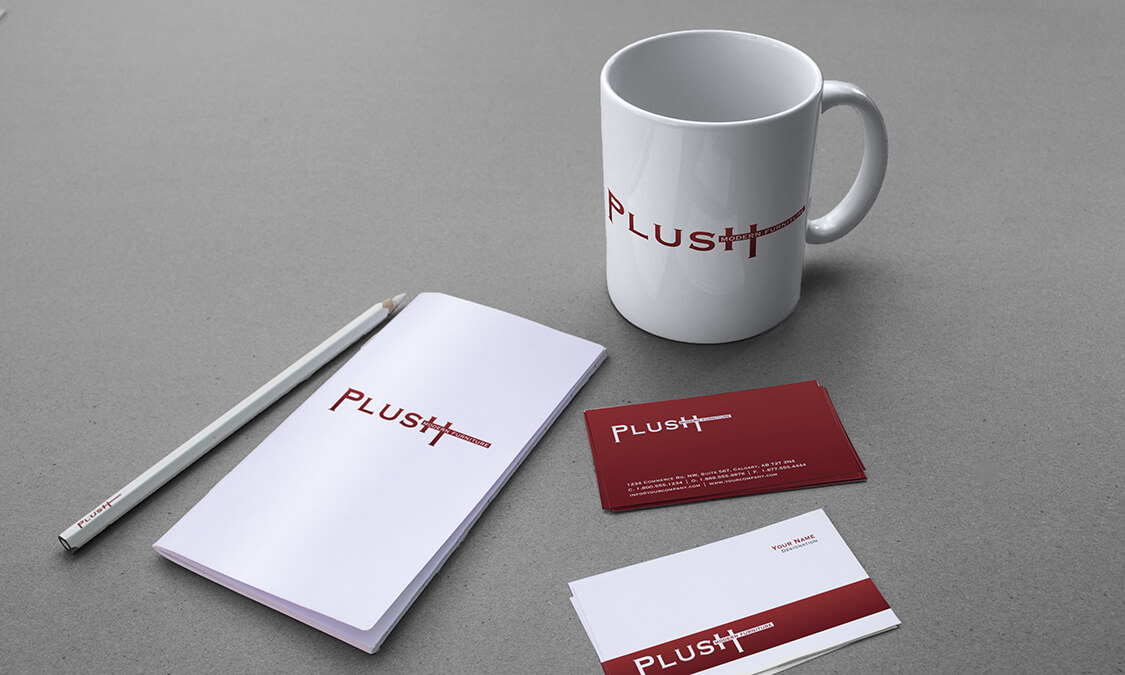
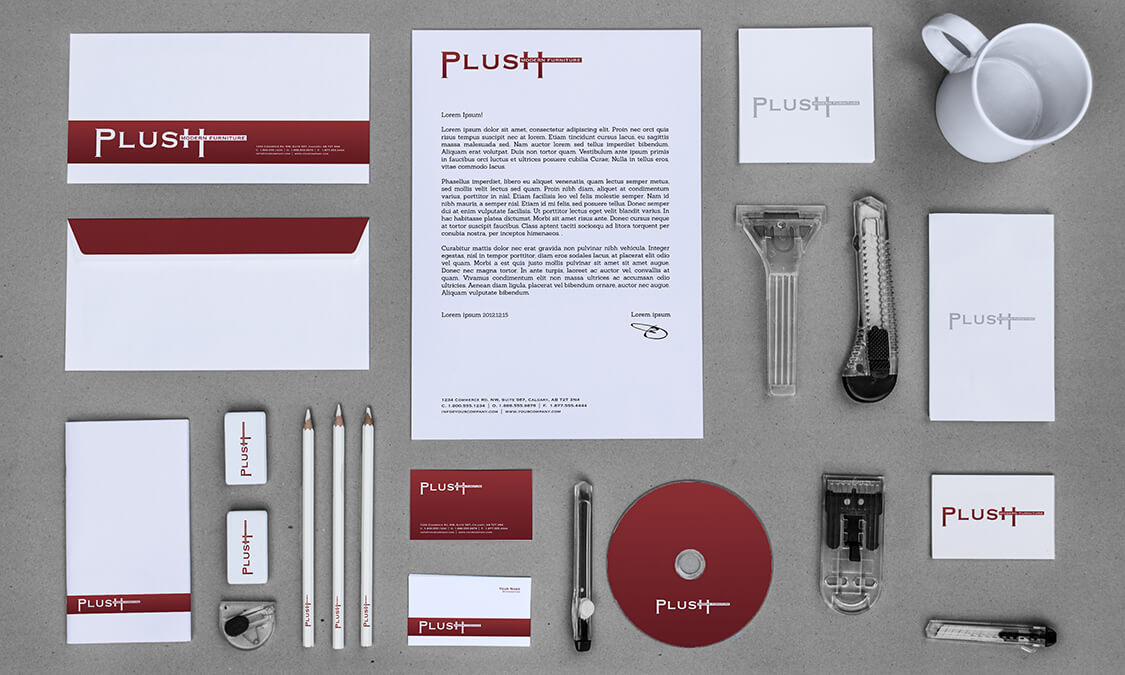
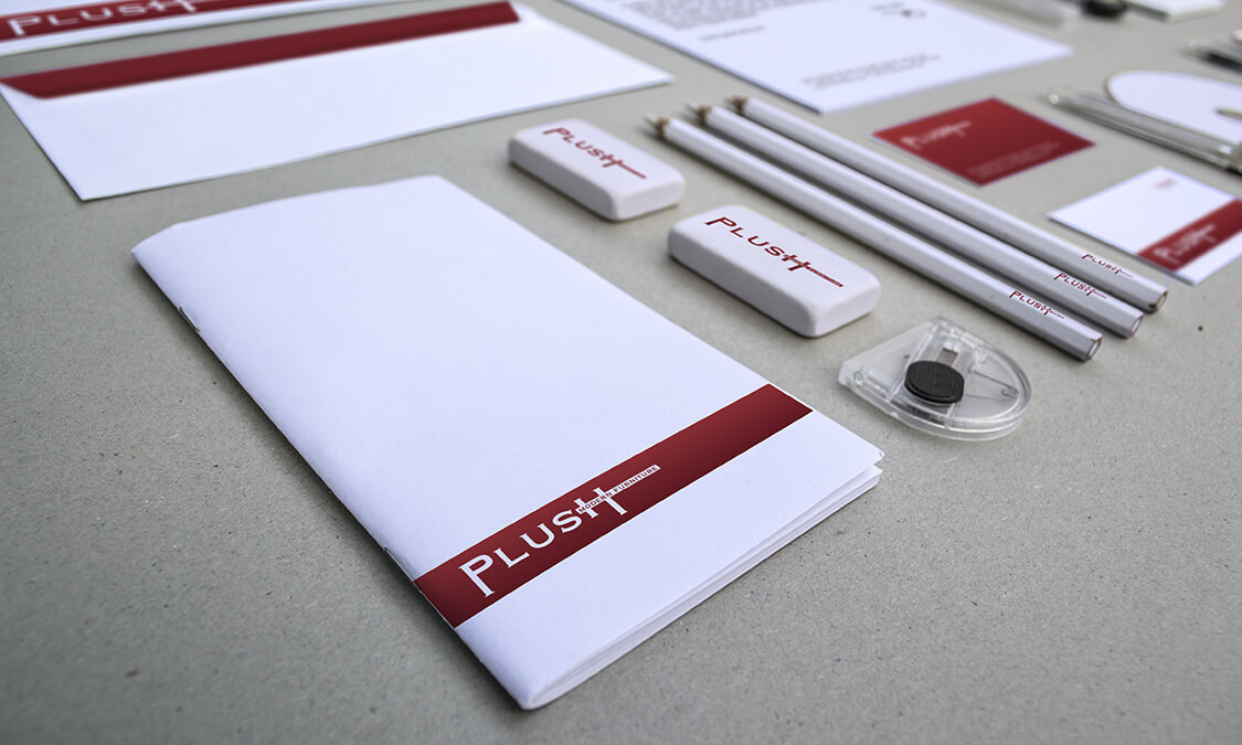
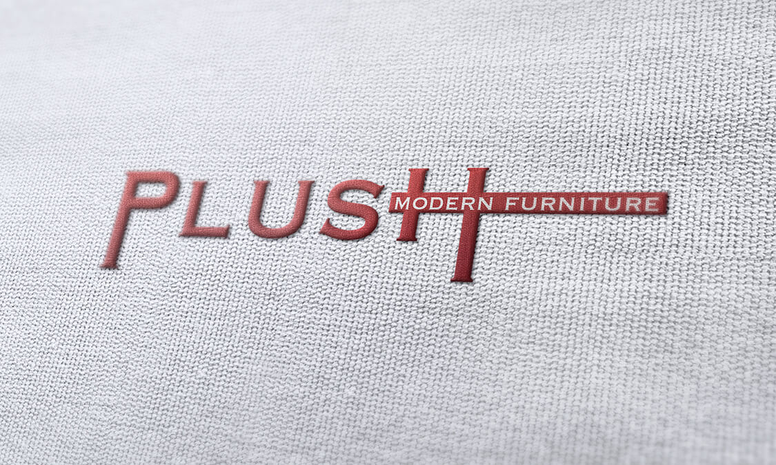
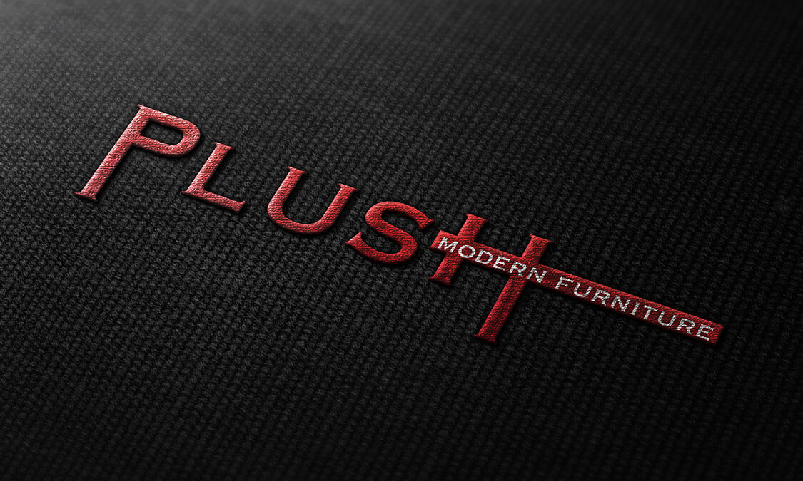
The elements of the art we could use were words. This amounted to the name of the company. We had to make the name of the client the brand, and simplify everything else by the judicial use of open space. The printed copy concept was fashioned first to create a logo that would work as a minimalist design in open space. To keep the lines simple and sleek we nestled the words within each other. If the line of the text created was elongated over the point of balance it would become clumsy and detract from the brand name. By layering the words over each other we created interest and depth without cluttering the
image.
Sumptuous
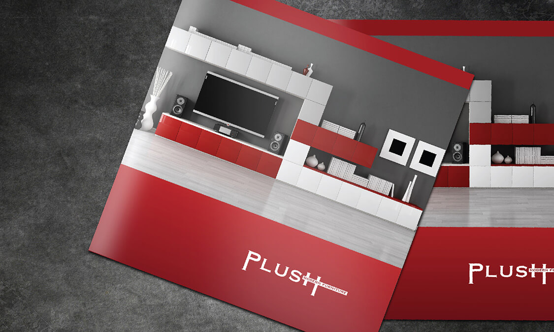
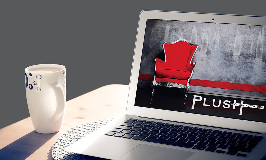
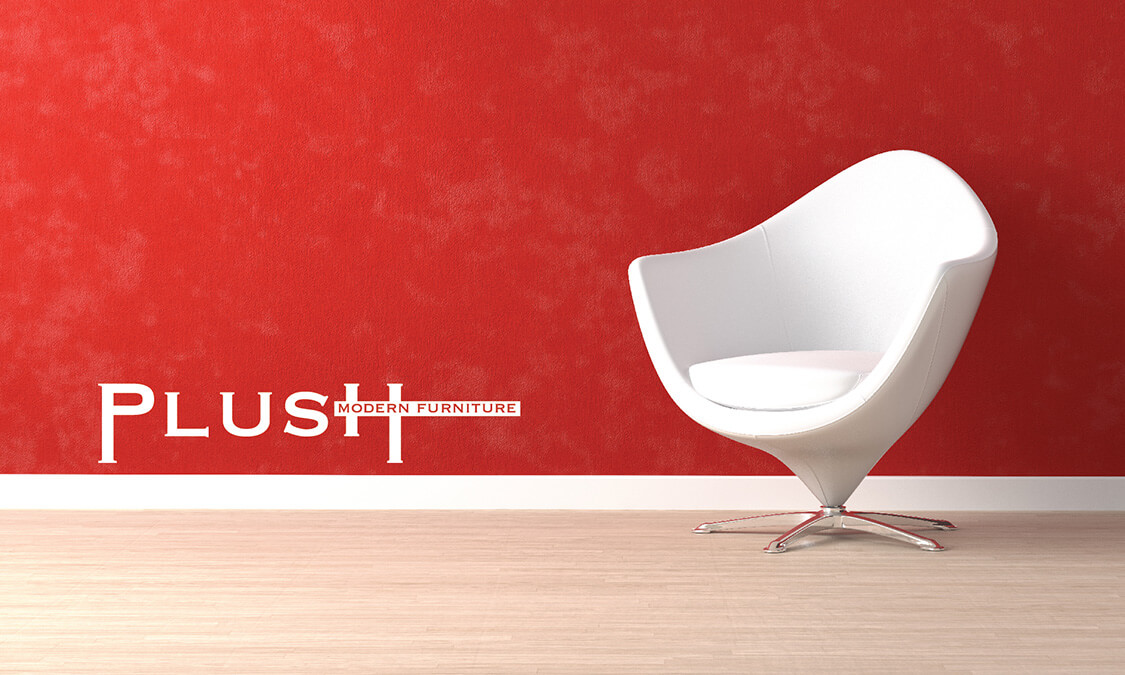
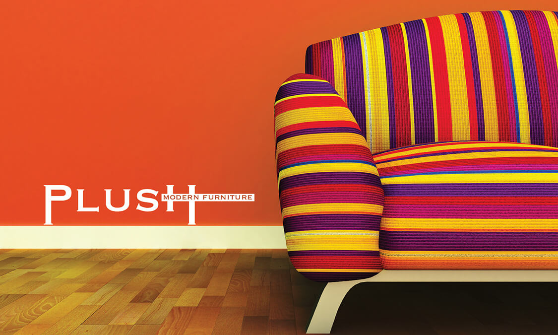
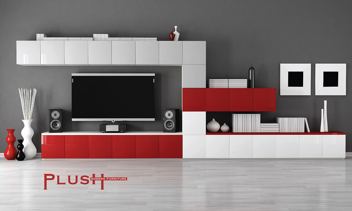
The design was delicately accentuated with colour as the principle of contrast is a major part of the modern look. By selecting stark white and deep, warm red we created the suggestion of simple sumptuousness and chic class. This delicious contrast was used to offset the minimalist nature and add enough interest for it to be memorable, without destroying the modern theme. The images we used played into this concept, with very simple, tightly cropped shots awash with natural lines running through the objects. To open the designs to a wider audience we also purposely included shots with bright products that were less strict in its application of modernist values, in a simple setting with warm tones that did not create contrasts. This bought the concept of modernism in the simple art and application but warmed up by colour and concept.

