Double
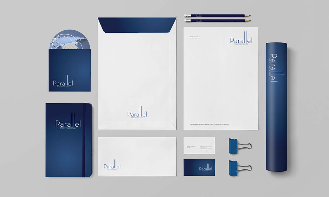
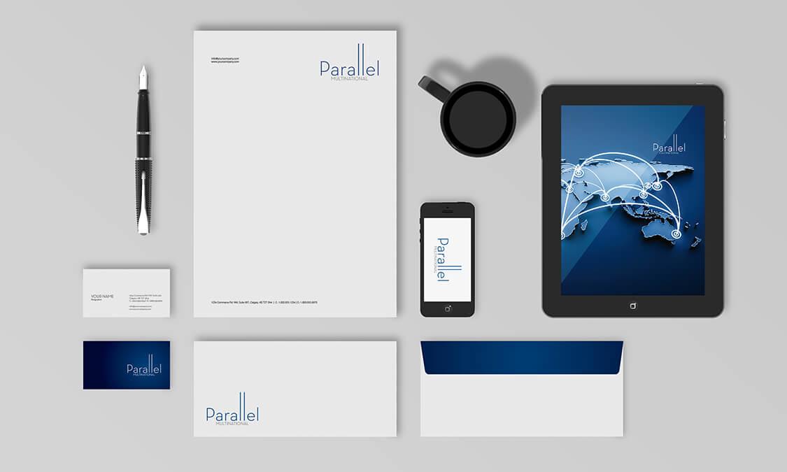
Parallel Multinational was a concept project that would stretch our creative capacity. Our invented client wanted a mixed concept that was traditional in one aspect but cutting edge in others. The effect that was demanded was a campaign that had different, interchangeable facets that could be used to fit the design on demand. We had to cover all artistic bases but somehow mesh them into a complete, cohesive portfolio able to be used for any application. The focus was not on expressing the company so much as expressing
the concept of nations being in parallel and working in parallel. The client wanted a minimal design, a traditional design and a mixture of both polar opposites.
Duplicate
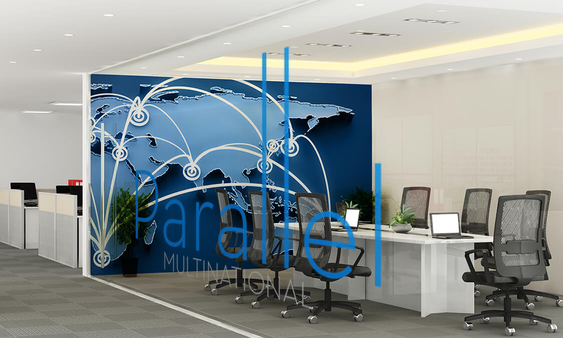
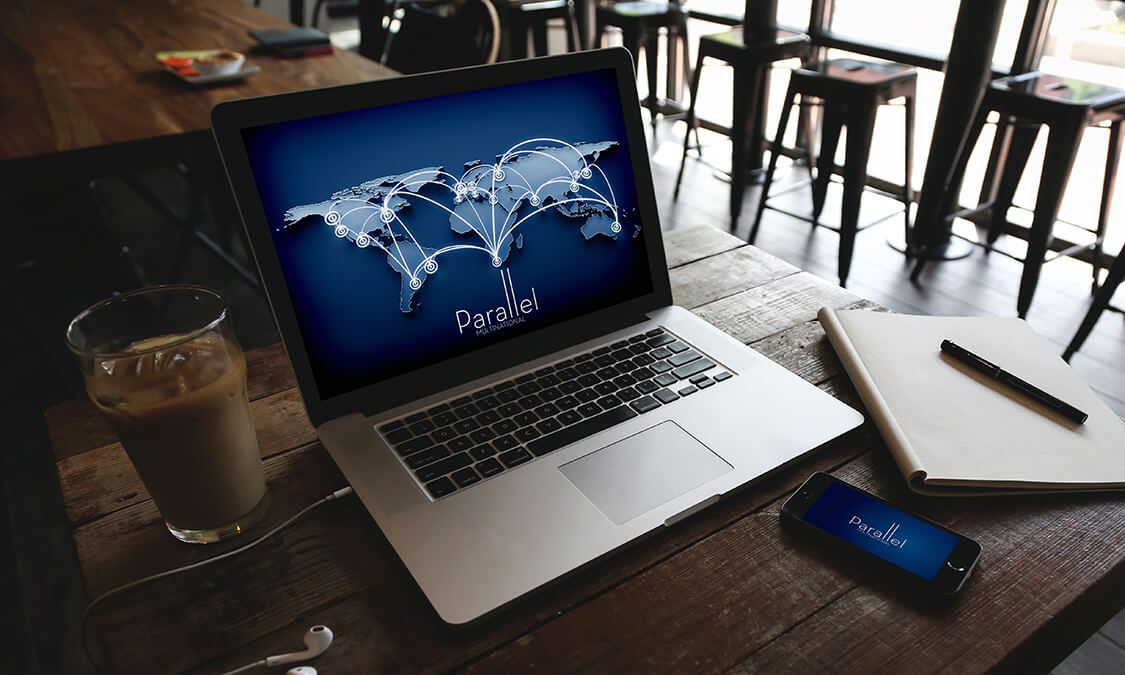
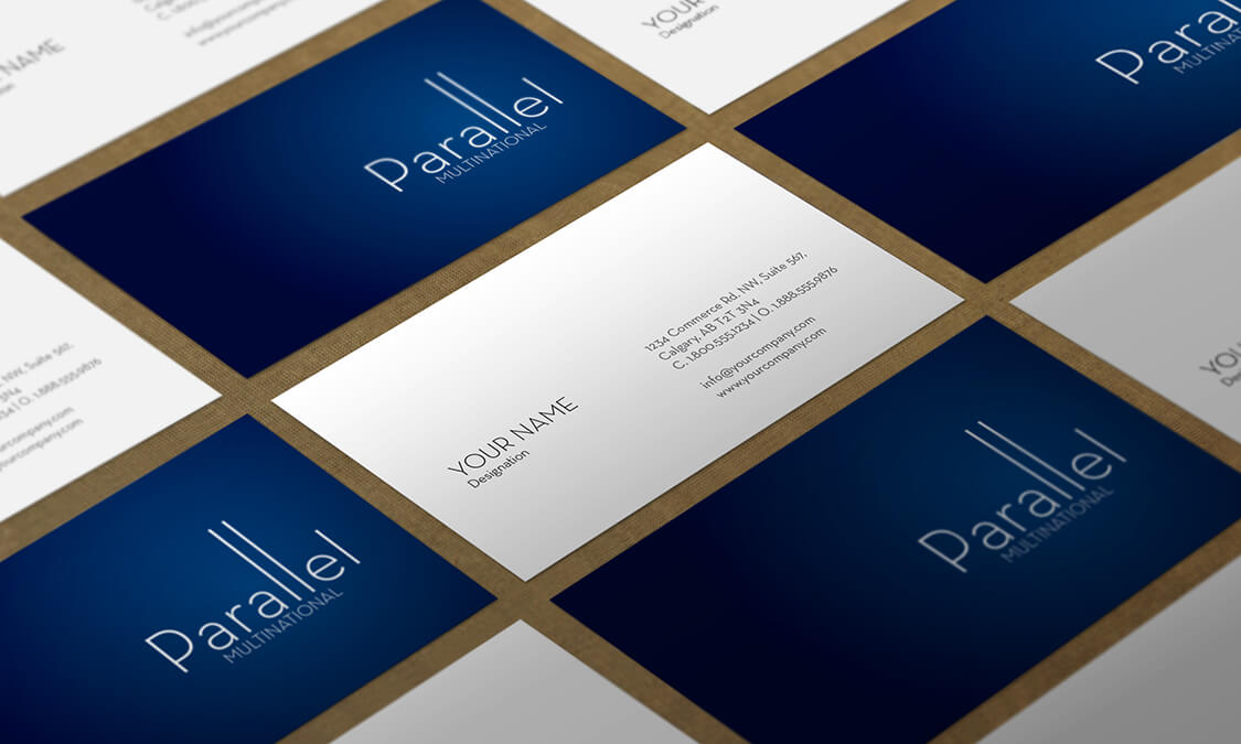
To imagine a design that fulfilled opposing criteria we decided to start with a colour as a base. A rich, deep blue was carefully selected from an earthy palette to suggest land and continents. This foundation meant we could build and intimate the other concepts, but the link would always be back to the multinational theme. The most striking design of the complete collection needed to be a representation of a map etched out of the colour base to reinforce the multinational theme and solidifying all the design art into following the project concepts.
Match
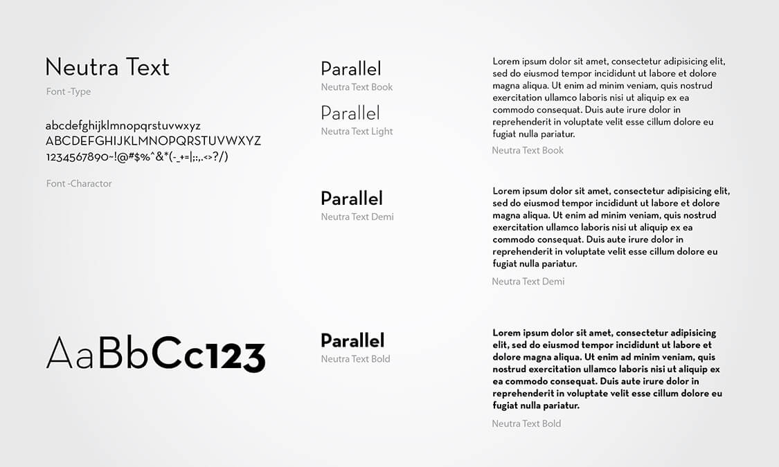
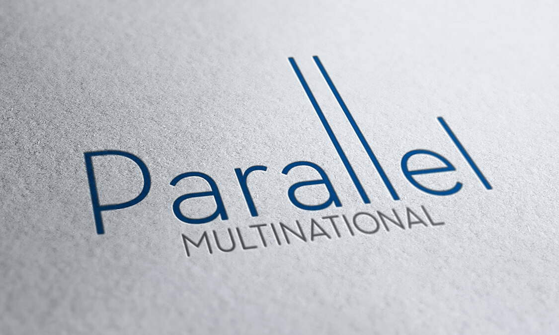
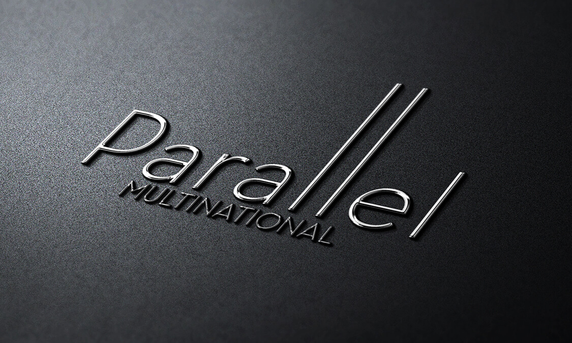
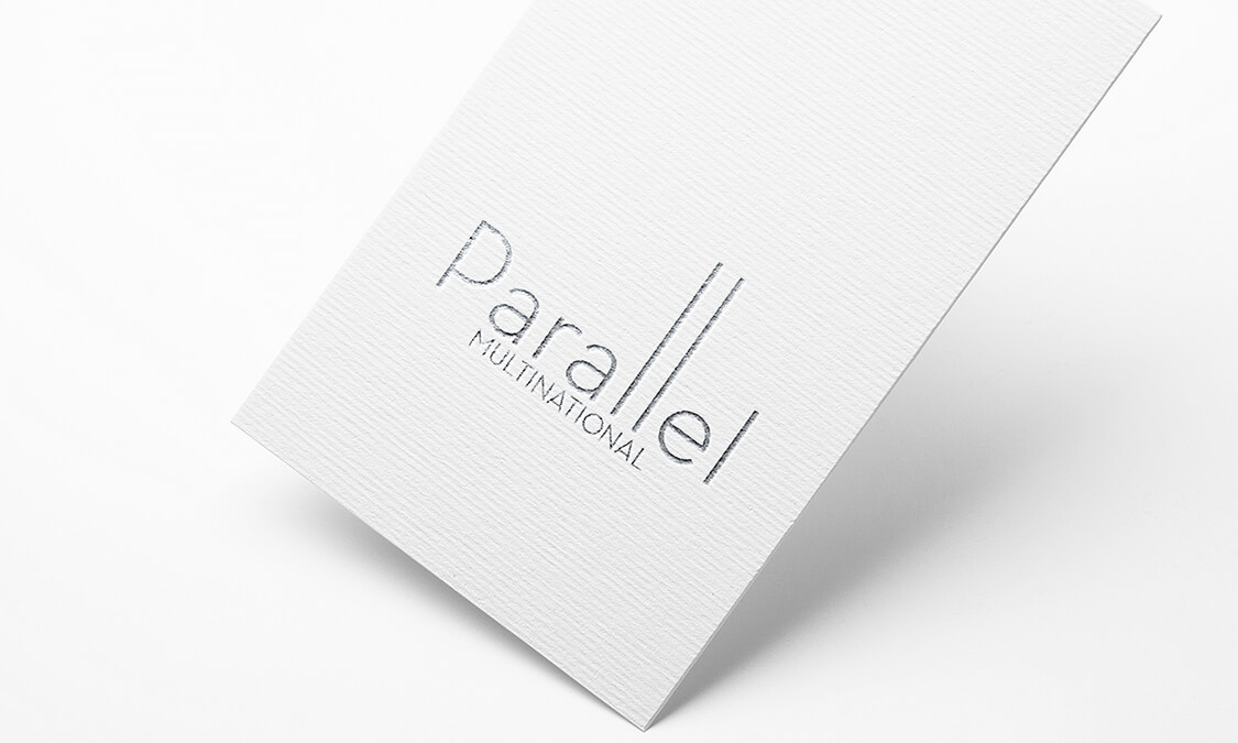
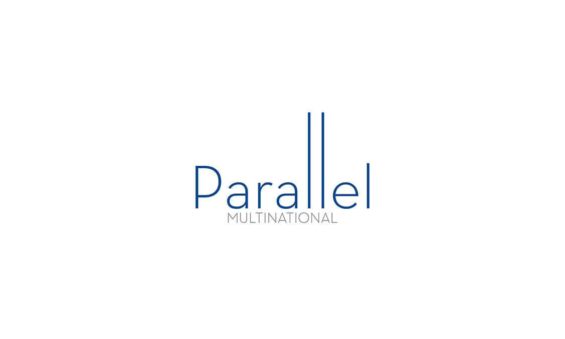
With the project anchor in place, it was easy to create a modern and minimal device as a brand that fully indicated Parallel Multinational as the owner of the image. To pare the elements back to its purest form we took the words and decided to make the lettering carry the message. Plain, simple and chic were the design brief for the font, and we chose something that was not distinctive in itself, but by judicial manipulation could be the voice of Parallel Multinational. As we took the font through an artistic evolution we found that by merely elongating the staves of the lettering it created an unmistakable brand logo that could be brought down to two letters, and still represent the company. We were very
impressed with the outcome of the project as it fulfilled, and exceeded, the criteria representing the company, suggesting all the core values of modernity, integrity and respect in clear, usable imagery.

