Green
Eco Geo Bio-Fuel was a concept company, and the idea was that they had a vision of what they wanted to achieve. Eco Geo wanted a heightened sense of transparency in their media as they felt that integrity and candor was a pivotal part of their brand. The principles behind Bio-Fuel are not well known, so as much as possible, Eco Geo wanted to bring out the processes that went into fabricating bio-fuel to increase the visibility and credibility of the product. The target demographic was any person or industry that used fuel, which was
a broad spectrum across all categories. The campaign needed to be very clear and easily readable, revolving around familiar objects for the chosen demographic to identify and correlate with.
Grow
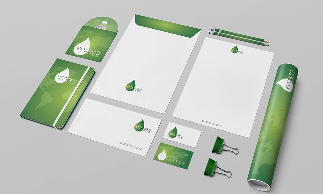
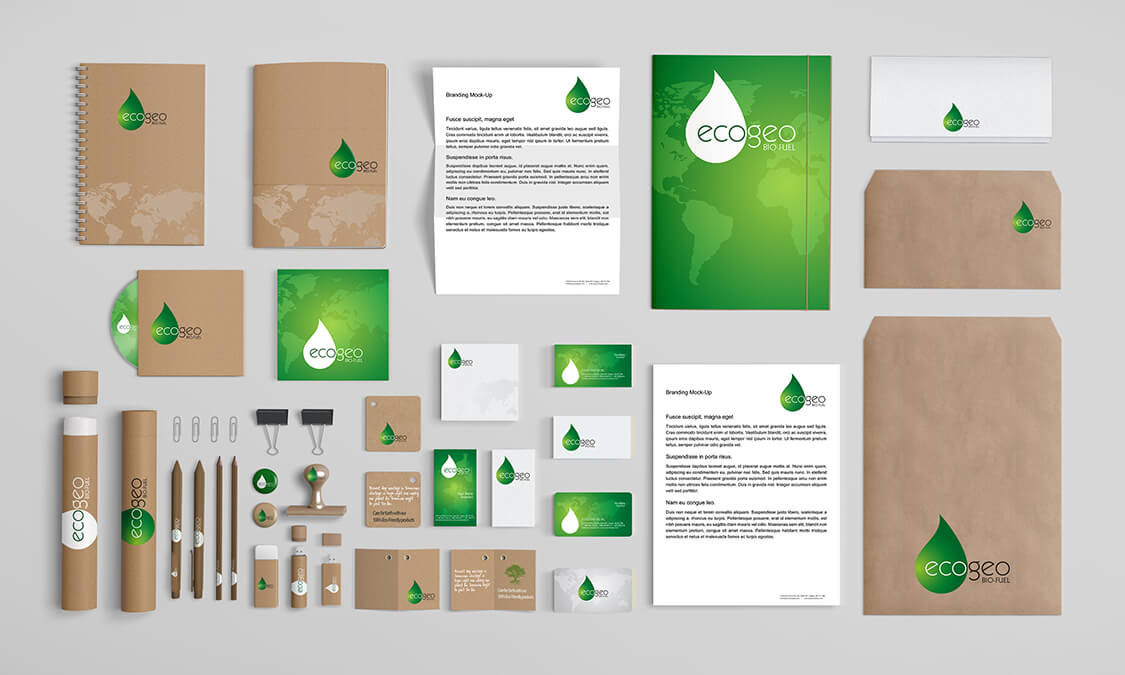
One of the most easily identifiable aspects of Bio-Fuel is its ‘green’ credibility. The green movement in recent years has etched out a niche of earthy, honorable and pragmatic reliability which we needed to demonstrate in all the media we created. By highlighting the ‘green’ aspect of bio-fuels we instantly added a dimension of credence with a simple application of colour. Green suggests growth, harmony, balance that can be a striking colour that demands attention when placed against a background of dark
colour. By designing the campaign around black, white and vibrant green the ‘Wow’ factor was at a premium and the brand identity solidified.
Generate
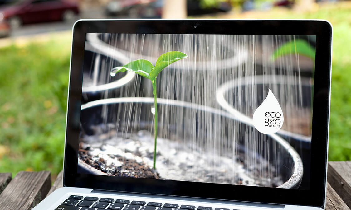
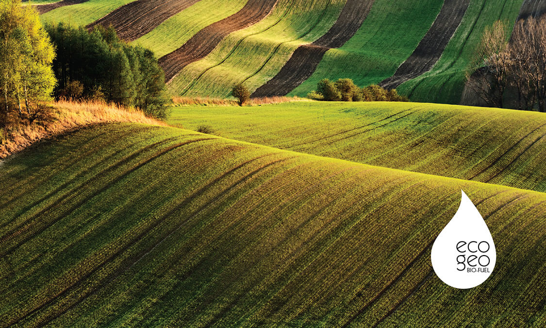
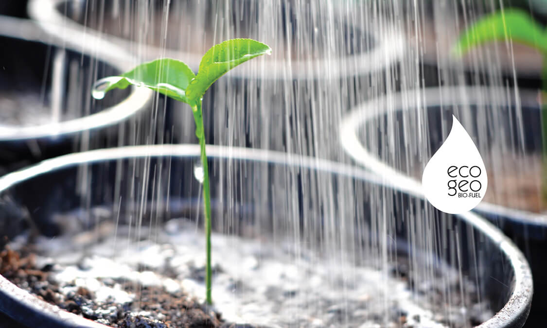
We engineered the logo into a crisp droplet shape to reinforce the principle of bio fuel, and keep it uncluttered and expressive. The font chosen was rounded in format to suggest the growing cycle from plant to energy, and to mirror itself in the droplet. A subtle map of the world was added to express the universal nature of bio-fuel increasing the transparency of the project. The images selected were ones that showed the process of the fabrication of bio-fuel in photos so that the target demographic could get an understanding of the authenticity of the green ideal, quickly, wordlessly and succinctly. The saturation of the colour was increased to produce the same hue of green throughout the whole portfolio
causing instant recognition and stepping up the visibility. The concept worked across the image and flat media and delighted us, and we felt everything the client needed and wanted had been exceeded with flair, proficiency and authenticity.


