The Company
Charleswood Dental was a concept that was envisioned as a dynamic project to be involved in. The profession of a client is always a theme we have to take into account in any marketing project as to successfully brand a company the brand needs to express the function behind the face. The idea was that Charleswood Dental also wanted us to include a media mix of common dental procedures to showcase them in a positive light and encourage their clients to realize what they can expect, in a supportive and reassuring way. Marketing dental procedures is not an easy sell. The marketing concept needed the reflect the excellent standard of the company, the corporate branding needed to reinforce confidence and the media needed to revolve around a professional web design that could be accessed and informative to clients, potential clients and peer practitioners.
The Concept
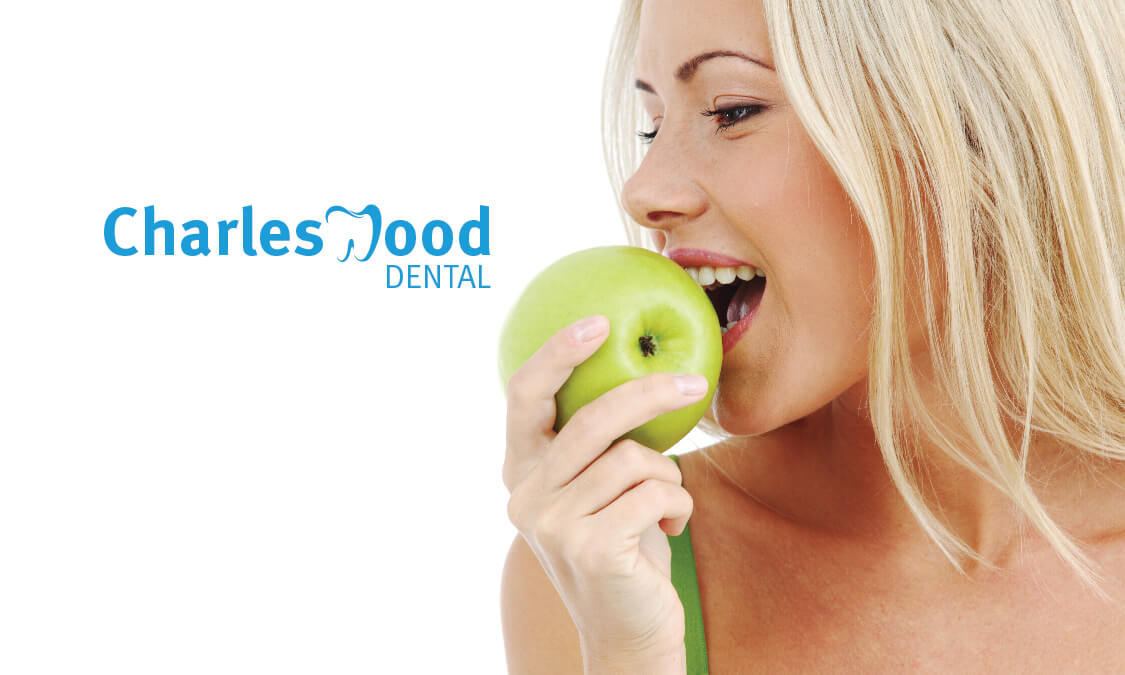
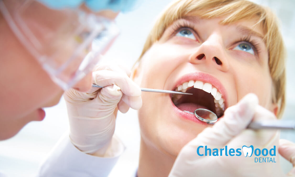
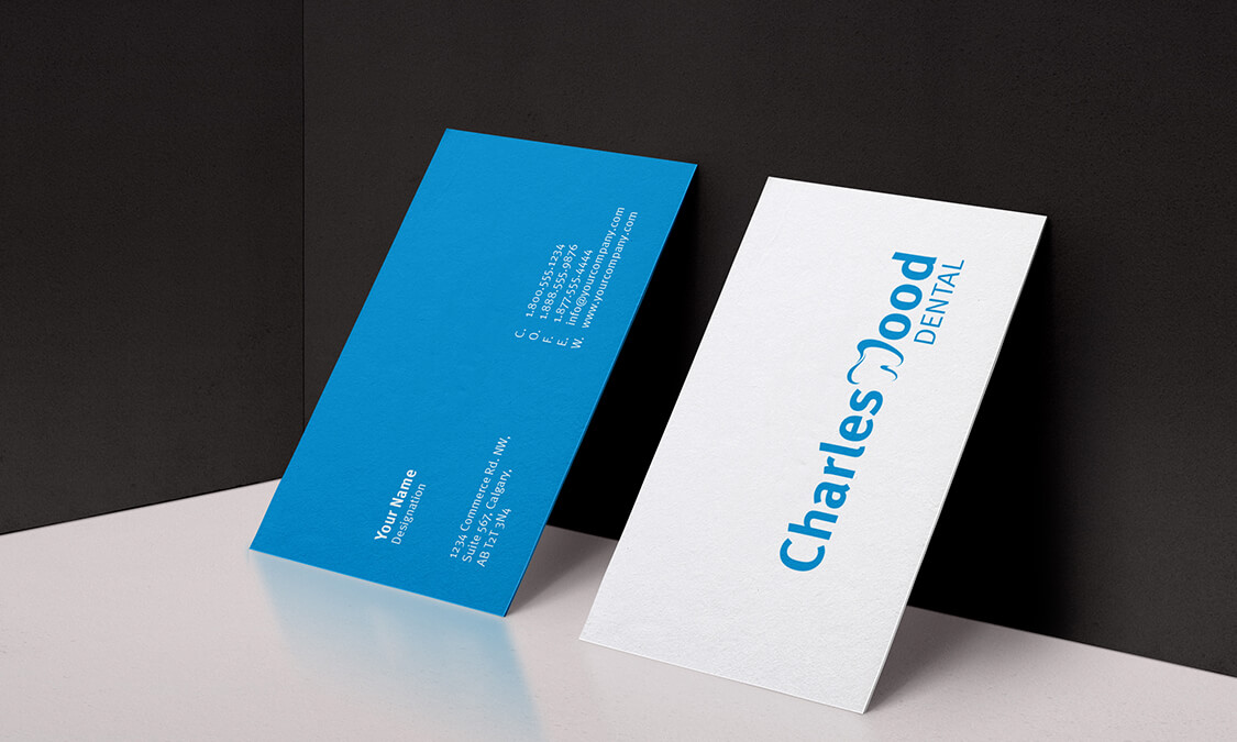
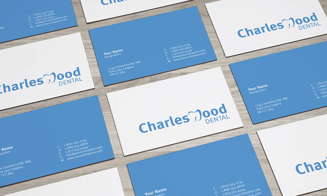
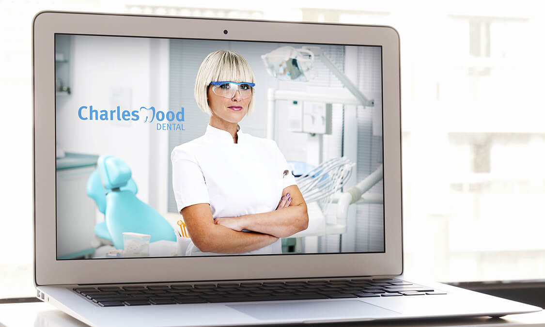
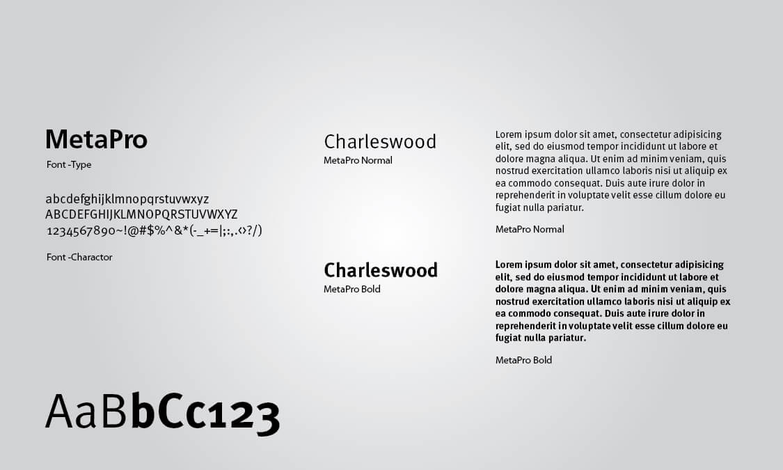
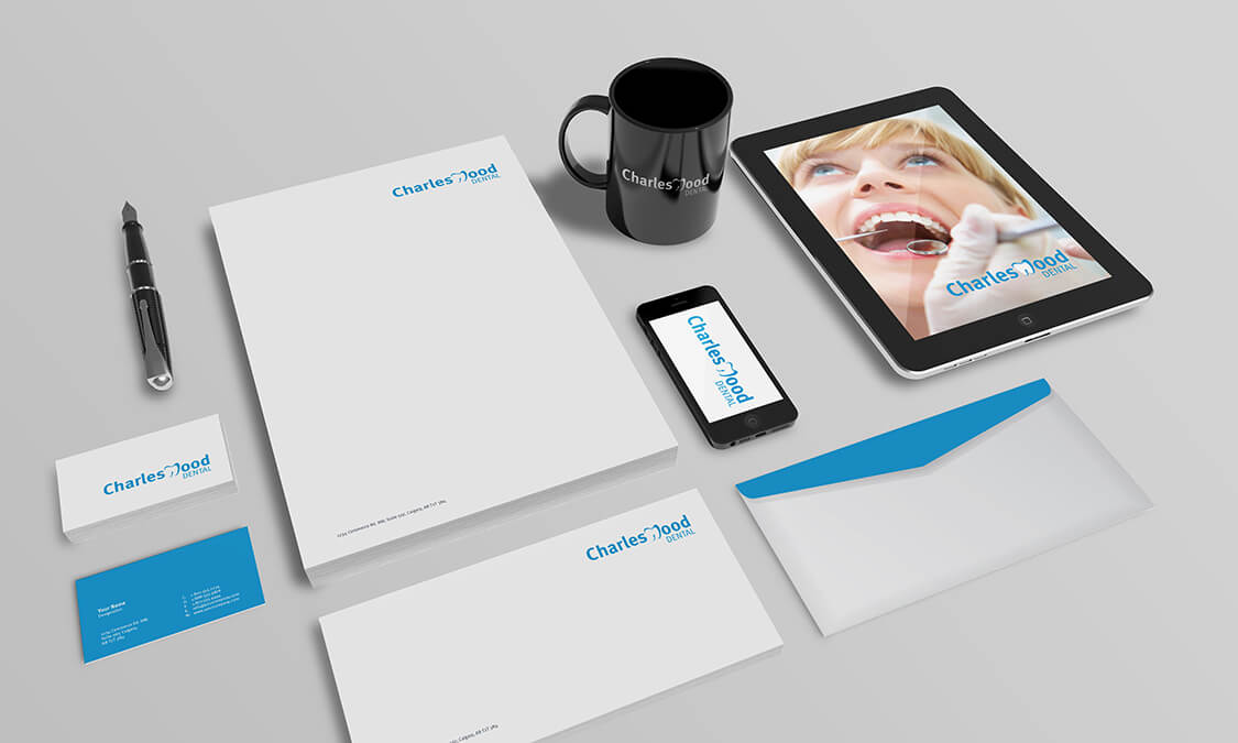
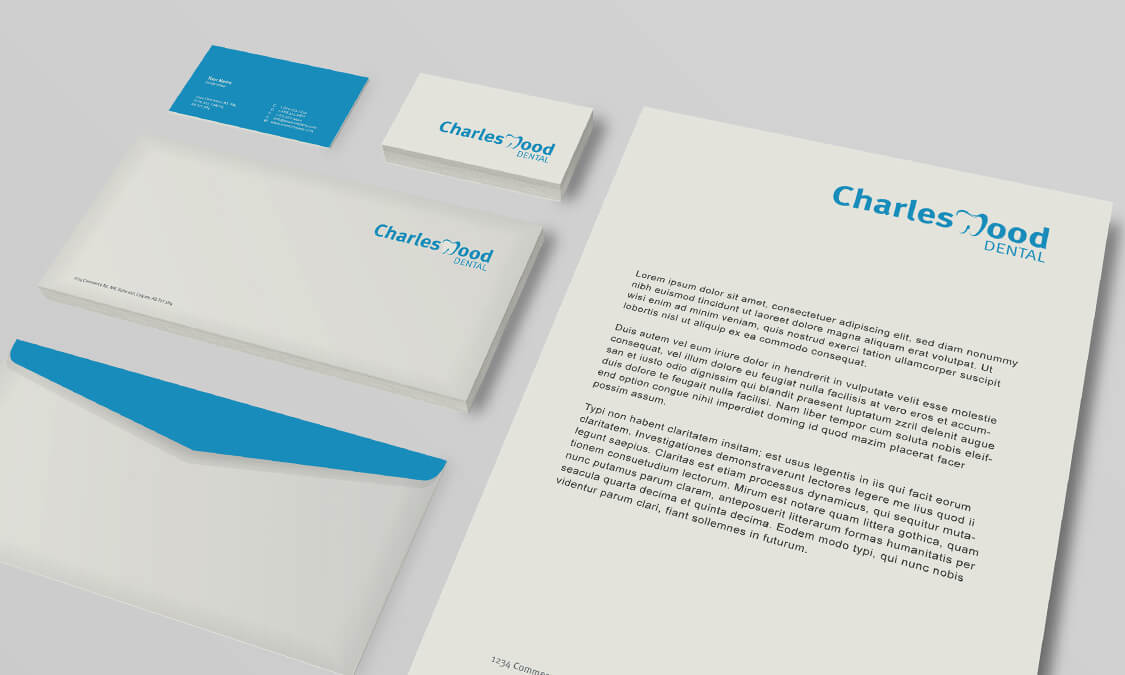
To successfully produce a corporate branding for Charleswood Dental we focused on the three themes that best expressed the experience. They were excellence, confidence and guidance. The images needed to display the quality of care that Charleswood Dental offered, which meant that uncluttered and simple compositions were used. The focus of any graphic or image required that we accentuated positive faces or actions that come from good health and confidence in a provider. Strong images of the practitioners were also used to engender a creditable credence, with a theme of white space to express efficiency, competence and sanitation. Blue was used to accentuate the white and continue the theme of cleanliness throughout the site, plain, uniform fonts were carefully chosen with images that were based on head shots of calm and happy patients having expert work being performed. These marketing concepts could be converted into any mix of media and continue the excellence, confidence, guidance themes throughout all Charleswood Dental’s correspondence, solidifying the corporate branding.
The Consequence
The resulting project was a successful fusion of installing trust in the dental experience, and providing the information needed to take the client where they needed to be. The professional web design was sleek and inviting, whilst validating an atmosphere of credited certainty. It was purposely created to be easy to use and each page promoted the brand as clean, healthy and professional. The images were expressive in the element they depicted, but also by the judicial use of space and colour, what they did not say. The demographic that the design was aimed at found the whole outlook of the media appealing and professional, and built up confidence in the dental procedure and reassurance of a positive outcome.


