Every company needs a logo. It is part of the brand that defines who they are and makes them immediately recognisable. The ancient Egyptians, Greeks and Romans all had ‘marks’ that signified ownership of property, or manufacturer marks, that indicate quality and lead customers back for future dealings, so it has been an effective marketing device decades for millennia, but what happens when you want to make a change? Or even worse, you need to make a change?
Here are some logos that have recently been through changes and let’s take a look at how they have changed and why.
Walgreens

Although Walgreens is not a company we have here in Canada, it is worthy of a mention as there aren’t many people who can’t recognize their logo – or at least, used to recognize their logo. There are many incarnations of the logo revolving around the distinctive ‘w’ and a pestle and mortar, but they are all a definitive brand and are unmistakeable.
This year Walgreens merged with an English drug company called Boots, with another distinctive logo:

Their logo has never changed in over 100 years since Boot, a pharmacist from Nottingham, England, opened his first drug store which remained in the family until the merger. Let your imagination run wild – what would you produce if you merged these two time honoured, the largest drug store chain in America and Europe’s biggest pharmaceutical wholesaler? Something solid, expressive and classic? Maybe…
… but we’re pretty sure you wouldn’t think up this:

The new design created by Straightline, is a globe shaped pattern of crosses, long a symbol for medicine, in blue and greens to introduce a feeling of freshness and health. The design is a huge departure from the classic styling of their respective logos and not one you would be able to pick out if the text was removed. Was this this grand graphic gesture a bold move by both companies to forge a new brand a create a feeling of modernization? No. The only reason they could allow the designers free reign was that each of their existing logos will still be used for their storefronts. After all, why throw the baby out with the bath water?
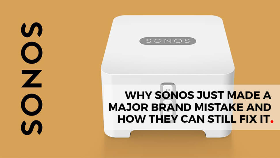
Sonos

Sonos have a strong presence in the high end audio scene for music lovers and needed a recognizable brand which has been produced by Bruce Mau Designs since 2011. The latest incarnation was described by BM designs as a ‘happy accident’ and is being used to represent the vibrant movement of sound out of source – the ‘N’ in the word Sonos.
Again, the finished design is a departure from the last three BM designs campaigns, so we can guess the ‘happy accident’ really was a ‘happy accident’ and not a marketing ploy.
Pitney Bowes

Pitney Bowes logo design has only gone through three incarnations. The first was in 1930, the second in 1971 and this one released this year. This logo was unique in the fact that it needed a redesign. Since the beginning of the company, Pitney Bowes has been heavily associated with paper and copying machines and with these now firmly consigned to the pre-digital age, the brand wanted to reaffirm to the world that they had moved on from carbon paper and fax rolls and were still a tour de force in the office equipment industry.
The new logo was based on the idea of ripples emanating from the source, like modern wi-fi or sound, and the source being a clever use of typography and lowercase initials. The base colours were kept intact to build on the familiarity of the Pitney Bowes brand and solidify the connection between brand and consumer.
Electrolux

Electrolux’s ‘new’ logo was called a ‘reintroduction’ of the 52 year old design that was so successful it even had its own typeface designed for the occasion. Electrolux Sans, created by Toni Hurmi, was inspired by the existing logo and used to compliment the mark and give it a new face.
“A visual identity is much more than a change of logo and color palette. It represents a new sense of Electrolux as a brand, what we and our products and services stand for and how we want to be perceived,” MaryKay Kopf, chief marketing officer said. “The new visual identity will build greater recognition by engaging people in a positive and emotional way; helping to inspire them, identify key benefits and find what they are looking for.”
These are just the beginning of the new logo designs and redesigns for this year, and it has got the year off to a great start with a few surprises and a large dash of design.
Resources:
http://www.brucemaudesign.com/work?project_id=108
http://www.electroluxgroup.com/en/electrolux-boosts-brand-with-new-visual-identity-20079/