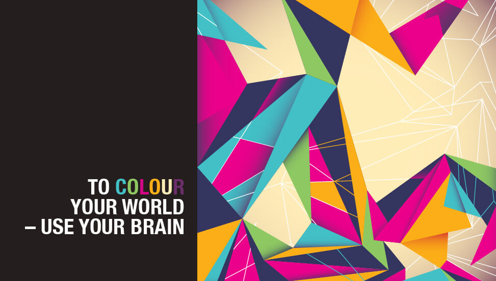
Making the most of your web design means taking advantage of all the different aspects of design, maximising their effect – and there are many, many aspects to consider. One that often gets overlooked in the stampede to the perfect web page, is the use of colour.
Colour is a more important element to a successful design than you think. It’s easy to look at the web design pages and only see the colours in a sense of how much you like, or dislike them, but did you ever stop to think why you like, or dislike them? Colour in design is not solely about how good it looks, colour also provides a ‘voice’ to a design that can influence the decisions that the user makes.
Choosing the right colour for your brand is crucial to the way it’s received by your target audience and you can’t ignore the fact that it will be the face of your business. It will be on everything you produce, from the front of your building to the packaging on your product. Once the choice is made you will soon be linked to it and it will be extremely hard to change. Customer association to a physical image is a hard thing to rewrite and often loses loyalty when it is tried. Making the right decision from the start is very important.
As much as possible you should make sure your design is linked to your business mission, set your brand apart and exemplify your image and industry. The psychological use of colour should be taken into account as it can change by culture, situation and industry.
All the colors above can be categorized into two basic categories: warm and cold. In general, warm colors, like red and yellow, send an outgoing, energetic message, while cool colors, like blue, are calmer and more reserved. However, brightening a cool color increases its vibrancy and reduces its reserve.
By judicial use, colour can empower your design but you need to know how to use it. Here is a directory of the meaning behind different colours so you can make the most of the web design.
BLACK
Although black is not officially a colour, it suggests sophistication, power and authority when used in a brand. It creates drama but in a classical sense so works well in expensive products, but overuse can suggest intimidation.
WHITE
The eye perceives white as a ‘brilliant’ colour, it catches the attention and ‘glares’ when in the light. White implies simplicity, efficiency, fairness and order. It also suggests cleanliness and purity. Overuse can make the image clinical and unfriendly.
GREY
Grey is a neutral colour that works really well as a foil for all other colours. It is a conservative colour and implies security and reliability. Be very careful with the psychology of grey as its over use can suggest that you are unimaginative and boring, without much creativity or motivation for action.
RED
Red calls for action. It is a strong colour that can be associated with passion or anger. It is an energetic, provocative, aggressive, attention grabbing colour that can be associated with danger. Red is known to cause a physical reaction in the brain that raises your heart rate and increases the pulse rate, so is best used for businesses that excite and stimulate strong emotion.
PINK
Pink is a nurturing, non-threatening colour and because of this is often used from women’s products. Hot pinks convey energy, youthfulness, fun and excitement and recommended for trendy products for young women and girls. Dusty pinks suggest sentimentality and light pinks inspire romance.
BLUE
If you are looking to express honesty, safety, dependability or responsibility then blue is the colour you need to consider. Strongly associated with peaceful places like the beach or acres of sky, blue is a universally liked colour. Popular with financial institutions, it inspires trust and stability.
TURQUIOSE
Although firmly in the blue spectrum, turquoise balances and recharges the emotions linking the colour to good communications and self-expression. Many telecommunication and internet providers companies use turquoise to suggest trustworthy communications and service.
PURPLE
Purple is a great colour to suggest voluptuous wealth and luxury. It is often used by creative types as it fuses the passion of red and tranquil blue and evokes mystery, sophistication and spiritual connection. It is a rich colour that can be overwhelming when used in vast amounts.
INDIGO/LAVENDER
Indigo is deep, dark shade of purple that is almost blue. It is a powerful colour that conveys integrity and sincerity but can also be mistaken for navy or very dark blue. Lavender is the very light version of indigo and evokes feelings of nostalgia and sentimentality.
GREEN
As a general colour, green suggests natural, wholesome, freshness and sincerity. It is associated with the earth and the goodness that comes from it. It balances emotions and inspires compassion. Like indigo, the psychology behind the colour changes with the different shades and intensities. Deep shades suggest wealth or prestige, whilst lighter tones are reassuring and calming.
YELLOW
Yellow is an illuminating colour that stimulates mental processes and encourages clarity. It is an optimistic, positive colour that creates warmth. The eye seems to pick out yellow before any other colour which makes it great for marketing displays and accent campaigns.
ORANGE
If you want to suggest energy, then orange is the colour. It creates enthusiasm, a sense of adventure and effervescence. It inspires optimism, sociability and suggests affordability. Judicious use of orange is advised as it is usually attractive to children, or considered childish.
BROWN
Brown is a kind, reassuring colour, suggesting earthy reliability and comfort. It is a great colour for outdoor and activity products. It conveys simplicity, durability and stability and is a great option for a company that needs the functionality of dirt coverage. Brown will hide dirt well, so if you are a trucking company or landscape gardener it will reduce the amount of washing it will need.
For every aspect of your web design, or any design within your company, think carefully about your use of colour. It can be a powerful tool in conveying the right message to your audience, so make sure you get it right from the start.