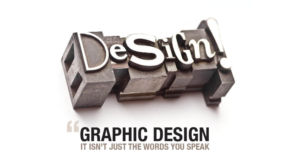
Words have been used for centuries to convey meaning and messages. From the very first examples of writing found in tombs by archeologists, its presentation seems to have been important. It appears that people have always taken notice of beautiful handwriting. In ages past when many hours would have been taken to learn the art of calligraphy and a suitable writing implement would have to have been handmade, well-presented lettering was often used to signify luxury or importance. Since those times things don’t seem to have changed much – we are all still fooled by a good hand.
With the onset of the digital age, hand created calligraphy has given way to the use of typography; the art of the visual presentation of words, but there is a place for both calligraphy and typography in modern graphic design.
The word ‘calligraphy’ means ‘beautiful writing’, and that’s exactly what it is. Each individual letter is designed to illustrate the context of the text and is hand drawn with the right inks, tools and medium. In ancient times only Royal, legal or religious texts were attended such artistic writing, but that was mostly as these were the only ones who could read. More often than not, calligraphers were artists that honed their craft designing new letters and letter families to attract customers and ‘trademark’ their work. The calligraphic artist could be recognized by the work he recreated.
Calligraphy is still used today in graphic design to create a unique look that would not have been before. Hand drawn letters and text can be manipulated to create a complete design where all the aspects are artistically made into a cohesive advertisement for the contents of the document. The designs are often very intricate and involved and always found on formal documents.
These days’ computers are commonly used to create beautiful individual letters that enhance the look of text. Unlike calligraphy, typography always has some element of technology used in its creation, but it is nowhere near as versatile as calligraphy. Typography is used to enhance the meaning of a word such as italics, emboldening the lettering or text highlighting. If effect we are all typographers as we use these types of graphic design devices in our everyday messages, but that does not make us calligraphic artists. The ancient Egyptians and Babylonians both tried to make typographic script by designing seals that were used with one letter depicted on each and they were used like a stamping set to create text.
With the ease of access to different styles of fonts, the use of typography is widespread. Even mobile phones have the ability to change the typeface used, but knowing how to use a font for maximum effect is the role of graphic designer.
Clever graphic designers take the time to explore the relationship of the lettering they use and the context of the project. They use the shape and style of the letters to convey a message about the finished piece that enhances the meaning behind the text. Typography often bridges the balance between the appearance of the project and the voice behind it.
Cal Swan, author of Language and Typography, makes this clear when he says, “These two distinct areas often come together in practice as there is clearly a very strong relationship between the conception of the words as a message and their transmission in visible form.”
There is a visual language and a verbal language in typographic art.
By judicial use of typography you can make a real statement about the text. Look at the example below:
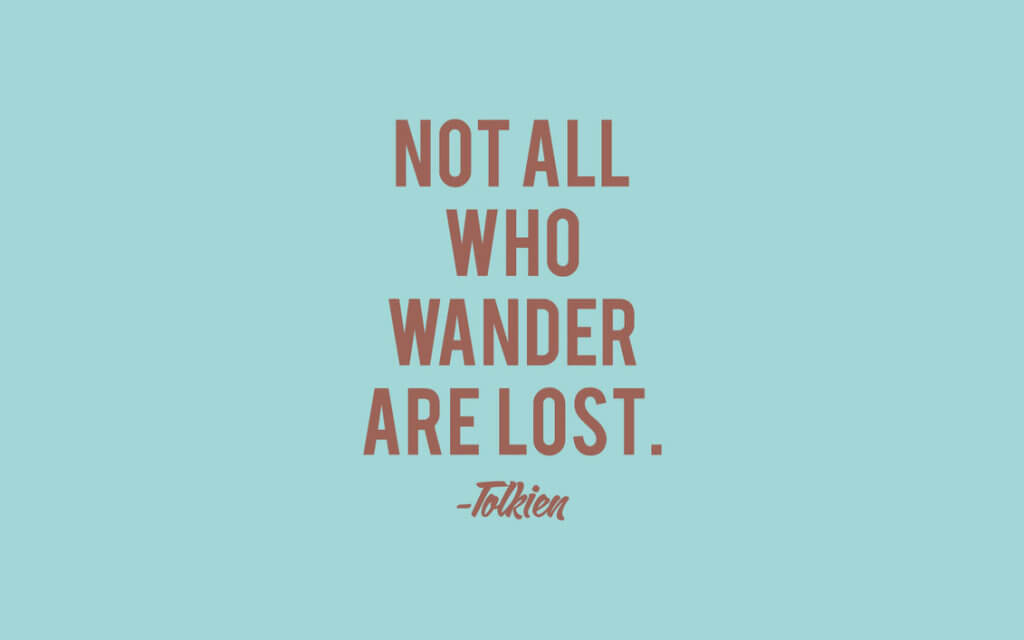
It’s a stylized quote that is using negative space to concentrate the focus on the words. The choice of colour is leaning towards the neutral scale in complimentary colour, but the typeface itself is plain, in uppercase and only the quote is plain text. The author is smaller and in more scriptive style to represent handwriting, but also to separate the author from the quote. This typography is to highlight the importance of the words. The impact is mild – it simply does not catch your eye and ask to be read.
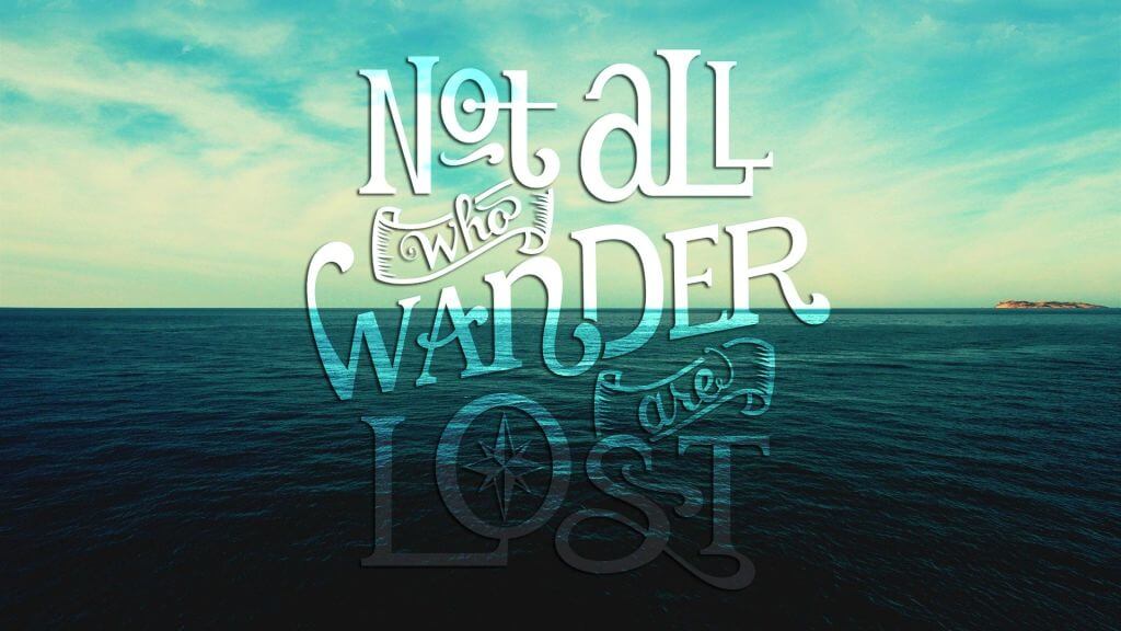
This is the same quote set in a different type of negative space. The image for the background is used as a foil to showcase the typography again, but the choice of font has been deliberate to match the background. The background is the sea and all the different fonts used have a nautical theme, and placed in similar proportion and position as the first example, but the use of fading increases the strength of the feeling of travel which backs up the whole pictures suggestions. The impact is moderate as it is eye catching, well balanced but has a simple but manufactured tone.
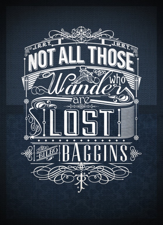
This example of the same quote is highly stylized, but only utilizes the power of the letters to suggest the theme and tone of the quote, and to put it in context. The name ‘Tolkien’ is not used, but his initials are at the top, either side for balance, and the symbol he used is at the bottom of the design.
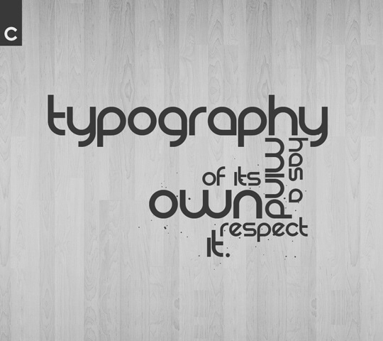
Each word, apart from three, are in a different font – and the fonts are all very different in nature and design. This is all part of the design, in fact, the difference of letter style is the design. The letters are framed in scrolls in a similar style to some of the words contain the image, and the complete design takes up nearly the whole space. There is no negative space because there is no unused space at all. Just a solid, contrasting colour to give the focus to the drama of the words. It has huge impact because of the complex design, the colour, the balance and the interest. The typography positively draws you in, almost challenging you to look further. The impact is unforgettable.
All of these examples demonstrate that text, given an artistic makeover, has enhanced meaning, and if it’s done right it can even alter the perception of words. Typography is a type of graphic design and a very important one. A large part of your message will be conveyed via your text choice so make sure you pay attention to the detail and maximize your leverage.
Don’t ever forget:
Resources:
http://ilovetypography.com/2013/02/13/lettering-versus-calligraphy/
http://arcreactions.com/live-visual-culture-age/
https://medium.com/type-talk/the-typography-lettering-and-calligraphy-cousins-d66543b0ff3c


